Raymarca
Raymarca
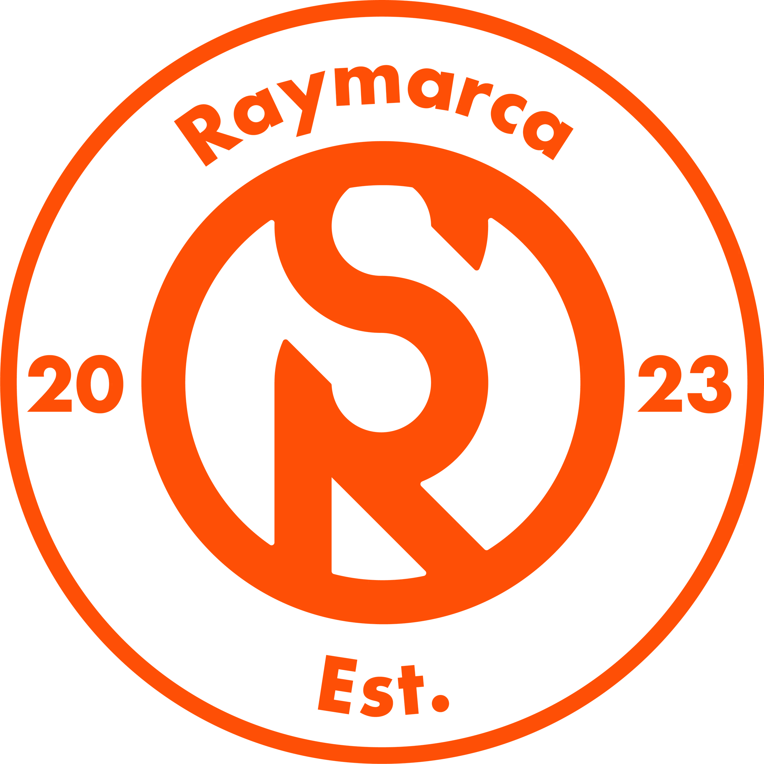
Identity for a car rental company: a Formula 1 wheel that integrates its founders’ initials.
01
Brand identity
Raymarca is not just a car rental company, but a brand that offers safety, quality and trust, backed by a team of professionals.
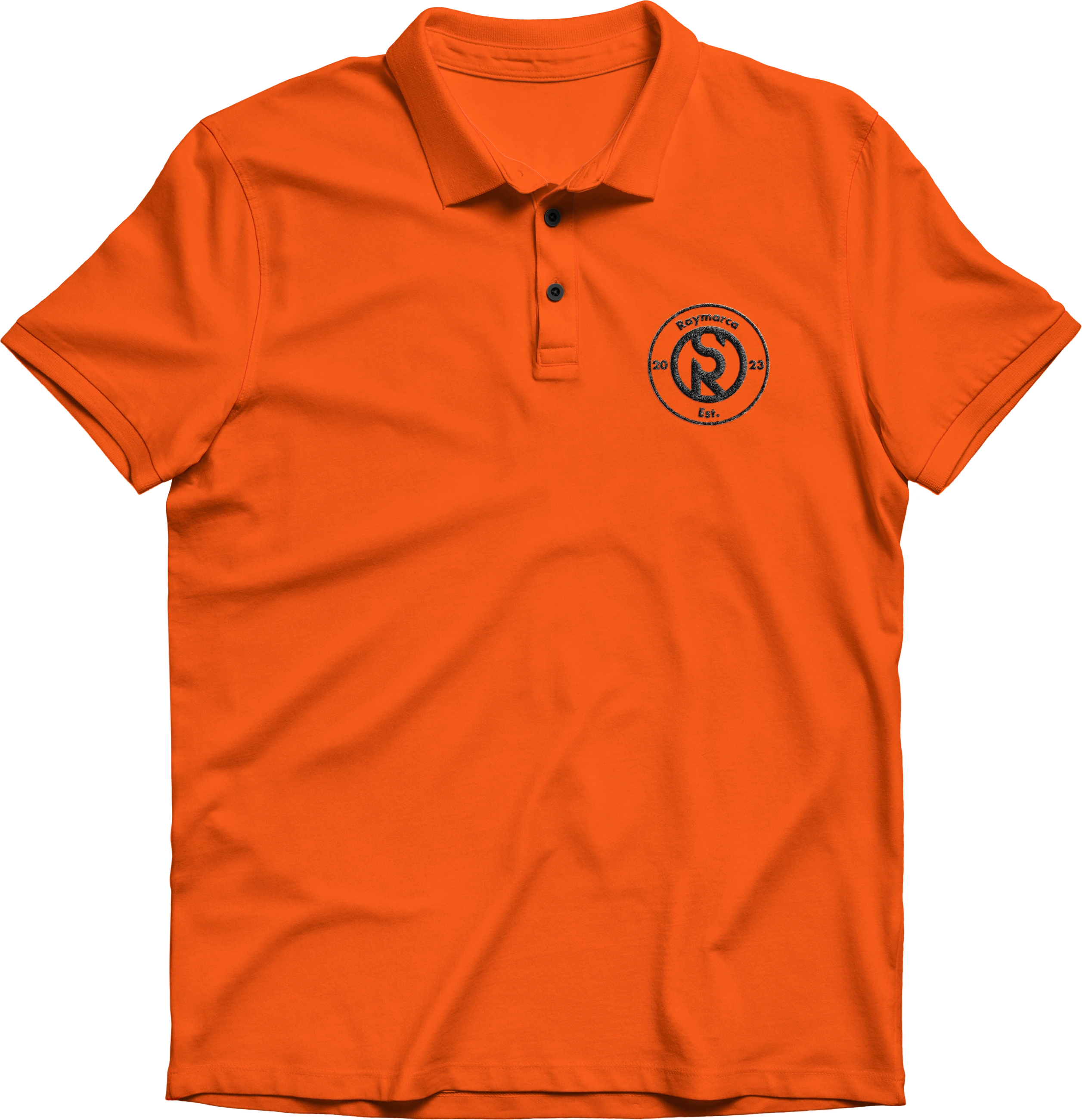
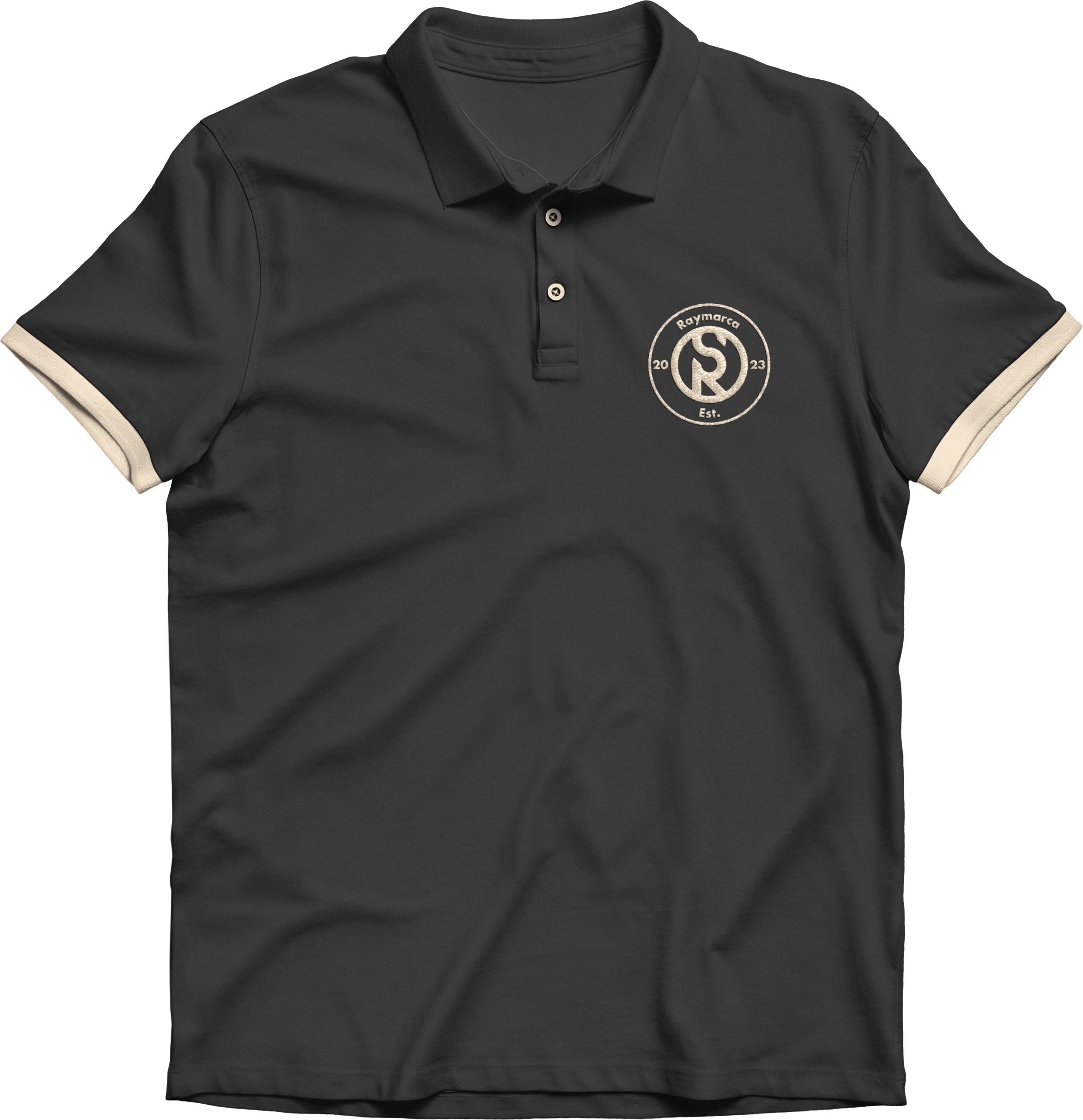
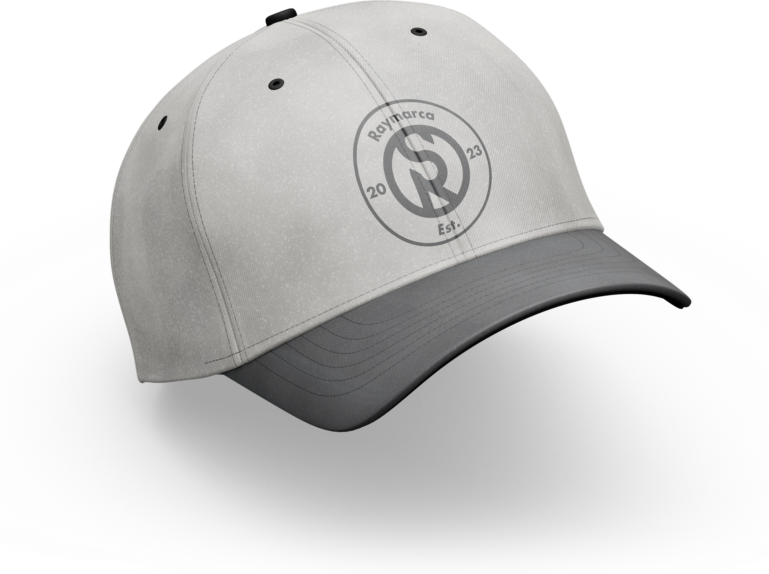
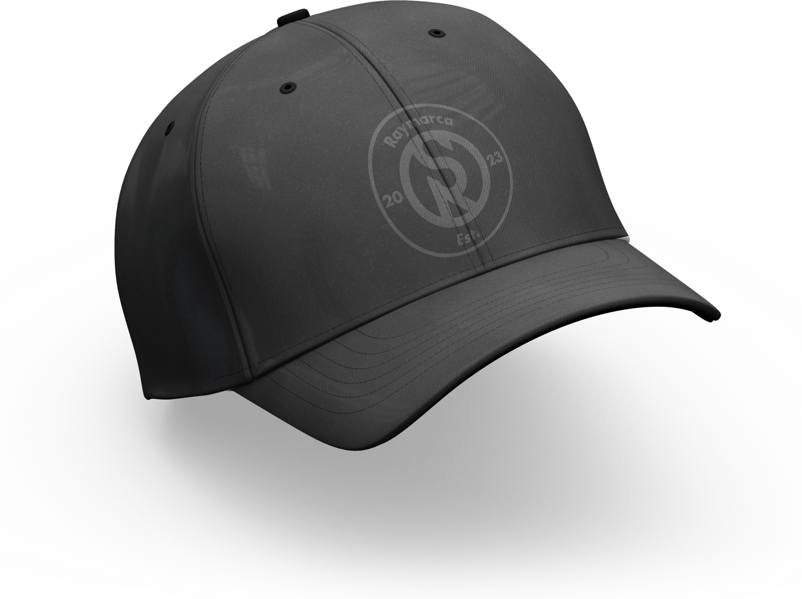
The isologo is inspired by the shape of a Formula 1 wheel, reflecting efficiency and speed, and integrates the founders’ initials as its central support, bringing solidity and a minimalist design that reinforces the brand identity.
02
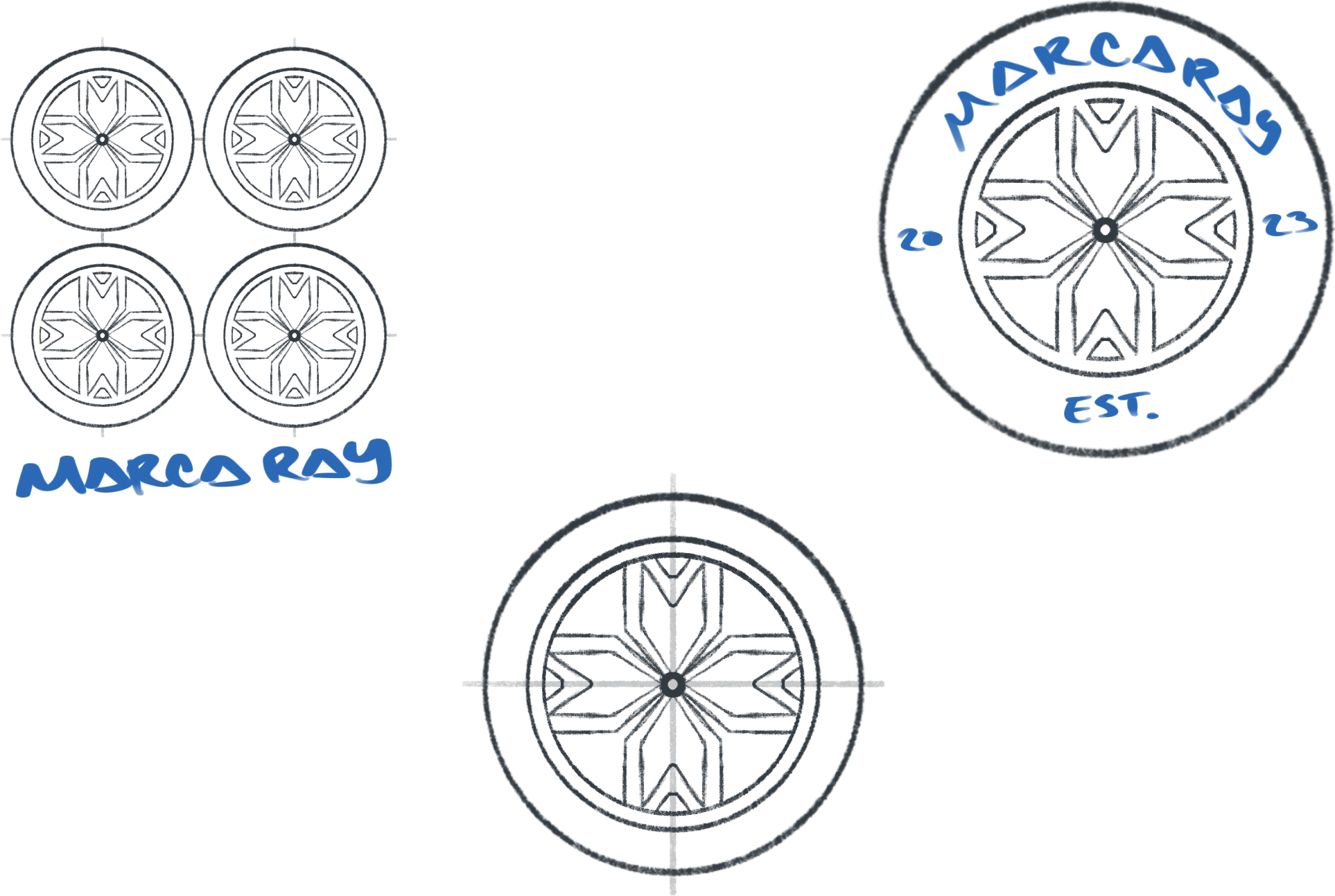
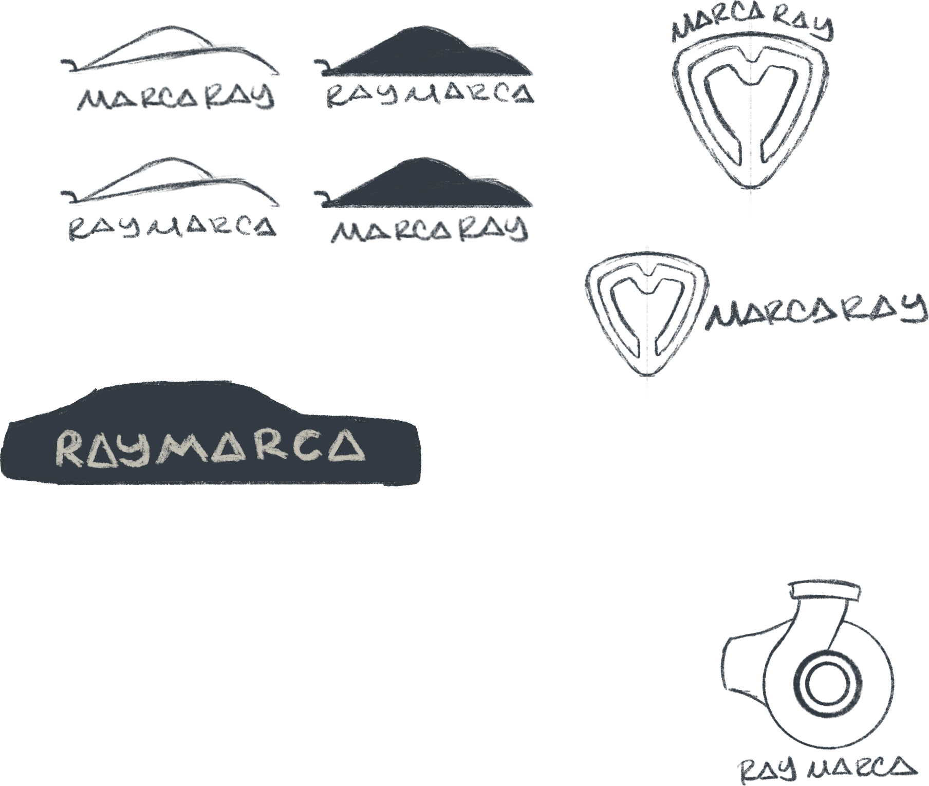
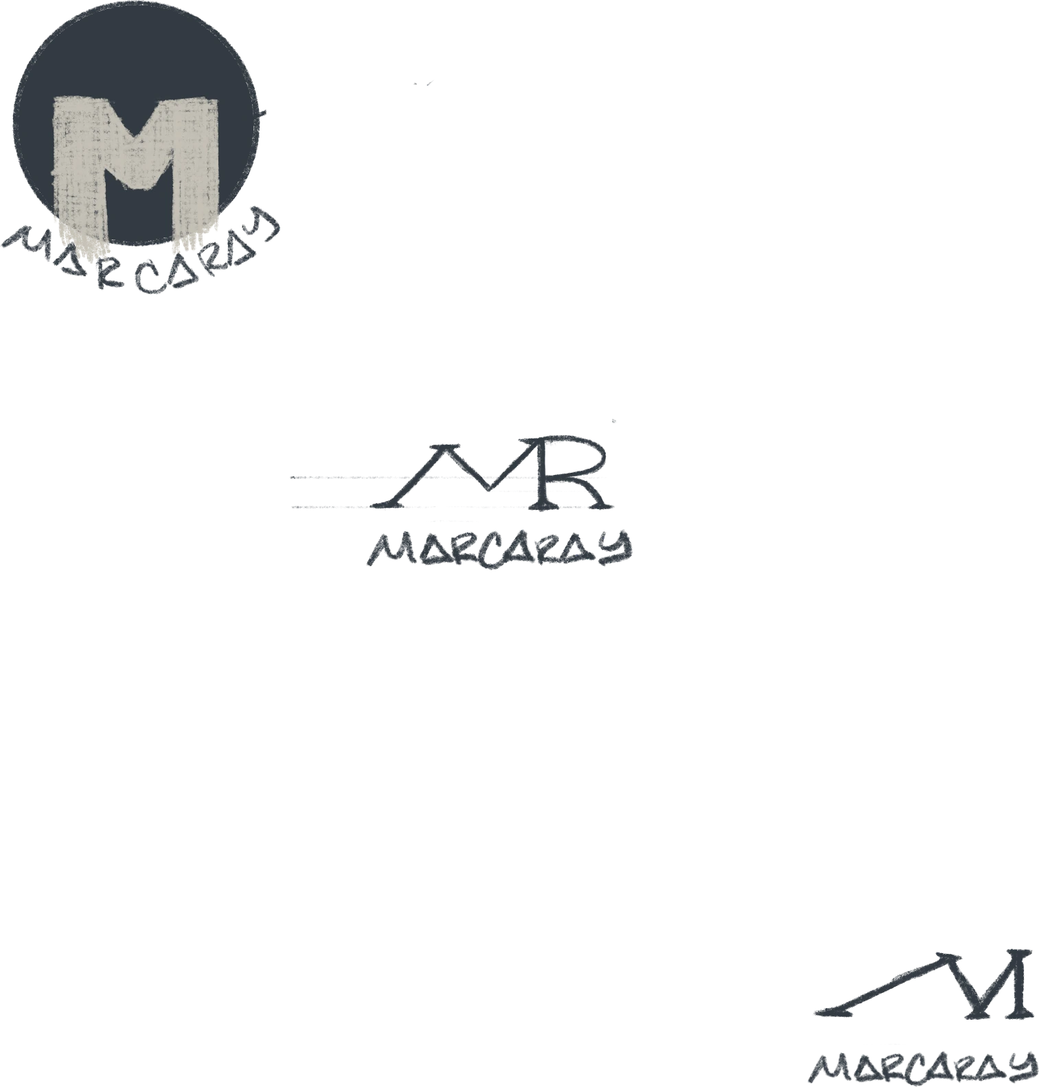
Sketching process
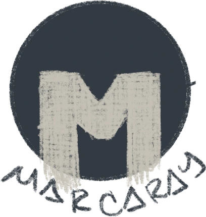
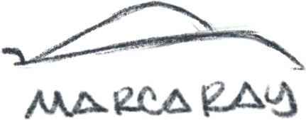
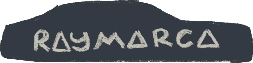
After the whole initial sketching process, the client changed the brand name to “RAYMARCA.”





Color palette
#2C2C2CCharcoalC71 M62 Y57 K70RGB 44 · 44 · 44
#FF4F07OrangeC0 M79 Y93 K0RGB 225 · 79 · 7
#FFEBD2CreamC0 M10 Y20 K0RGB 255 · 235 · 210
#273248Midnight blueC89 M74 Y44 K46RGB 39 · 50 · 72
Typography

Mockups