Zambos (concept)
Zambos Premium
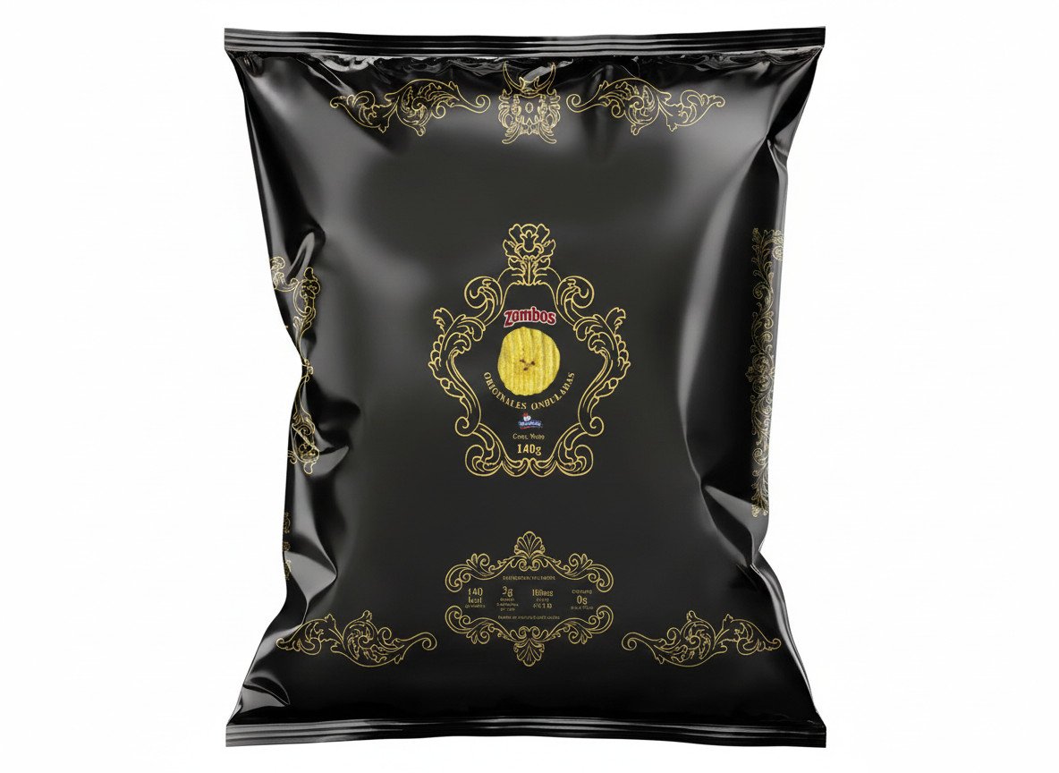
Fictional premium packaging for a snack: a Baroque frame in black and gold with the Monas Hieroglyphica hidden in the design.
Creative process
For this fictional project, the brief was to choose a product within the snack category. The conditions were few but decisive, since the only requirement was a premium packaging design, meant to sit on the supermarket shelf in its target audience’s section.
I started thinking about how I could represent what was asked in an appealing and unusual way (creative, obviously, and in my own “style”).
As always, I started thinking about how I could connect it to some of my own interests, and that day turned out to be one of those days when, while doing something completely unrelated, a great idea for solving it pops into your head. I quickly wrote it down in my notes and that was it. The core idea is to represent a style somewhere between Baroque —mostly because of the amount of detail— and Renaissance, and I pictured all those details applied to the packaging.
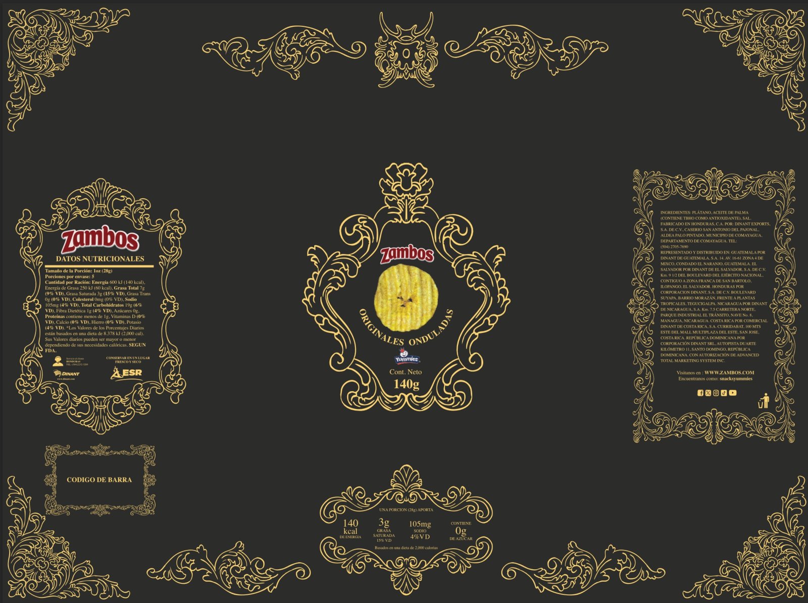
Then I took the product photo and started illustrating the sketch and the layout of the elements in Procreate, such as the nutrition facts, the barcode, the basic information and so on. It took me quite a while, but in the end it was worth it: I delivered what was asked and it turned out pretty cool. I hope you like it.

The personal signature
In these fairly open projects, I always try to mix in or leave my mark somehow —not as branding as such, but more as a personal signature. In this case, I used part of an original symbol whose real, scientific name is Monas Hieroglyphica, which represents a theory by the English magician John Dee about the different elements that make up the universe.
Since I’m a fan of this concept, I took just one part of it and adapted it so it would accompany and decorate a section of the design without stealing the spotlight. So I’ll leave it to you as homework to look it up, because I’m clearly not going to tell you which part of the design it is.
Then I chose black and gold, since I tried white and gold and it didn’t work as well because of the type of packaging and its material. The idea was to achieve the best possible contrast.