Maconse S.A. de C.V.
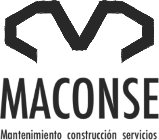
Maconse
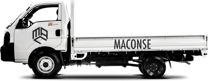
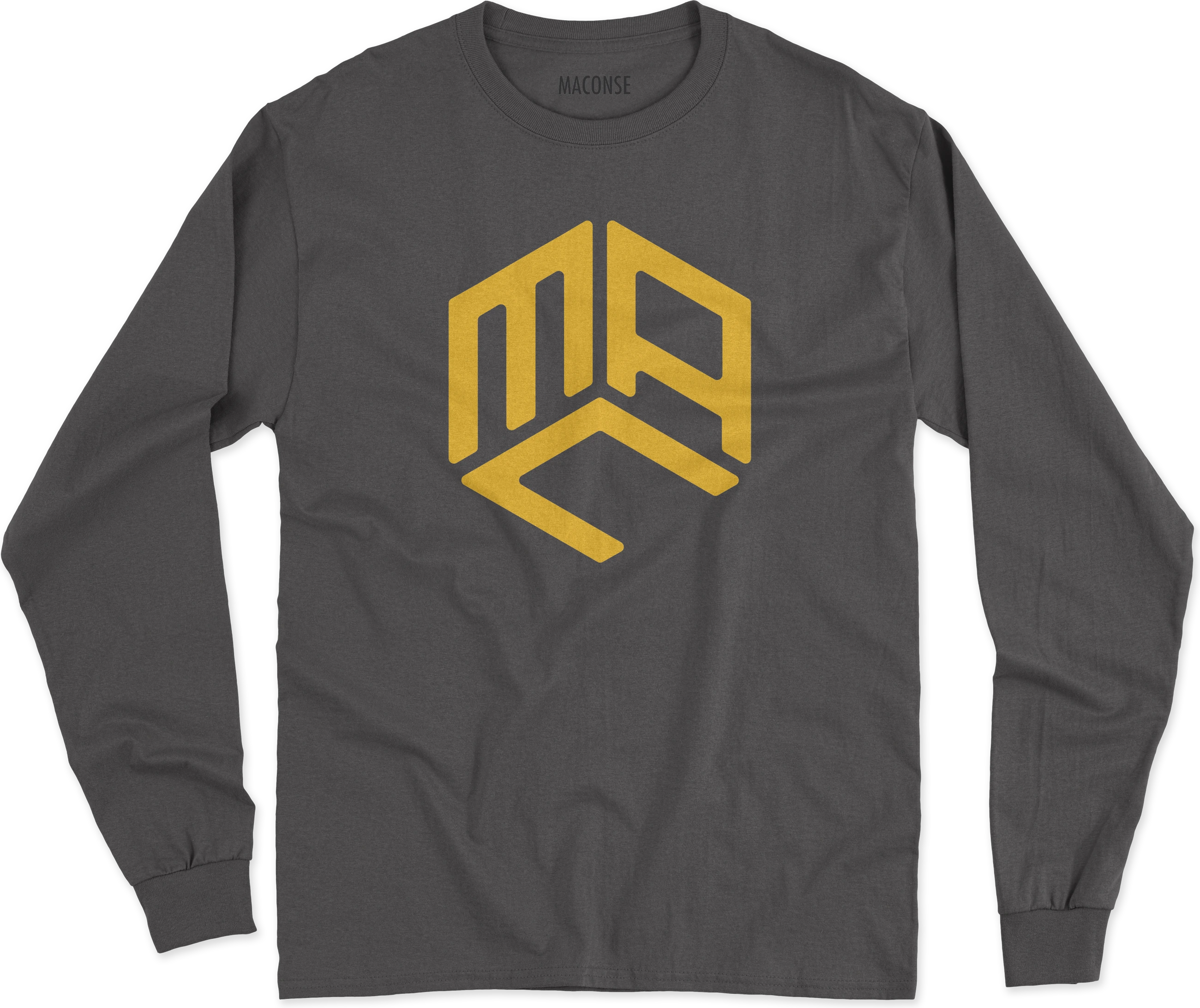
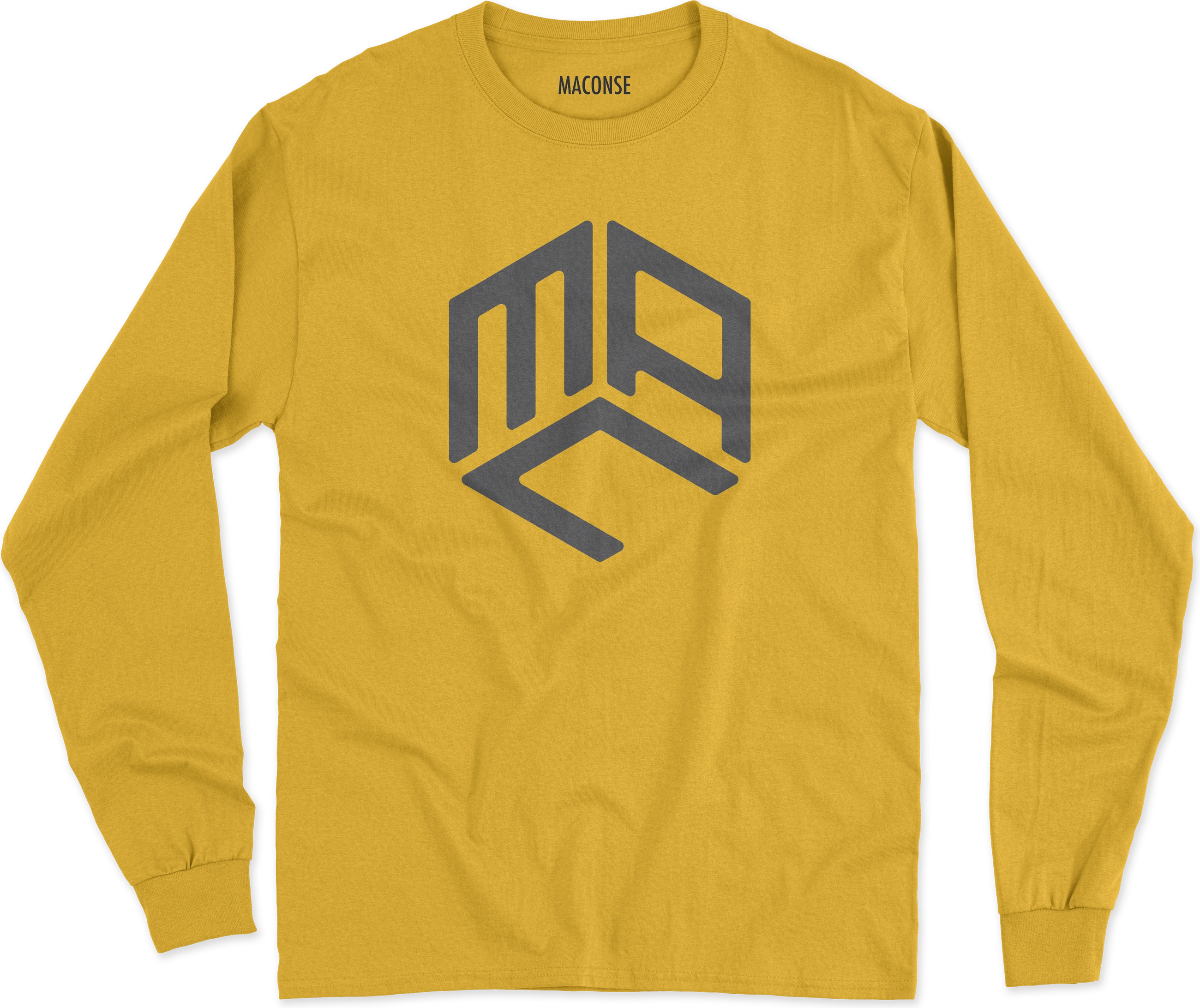
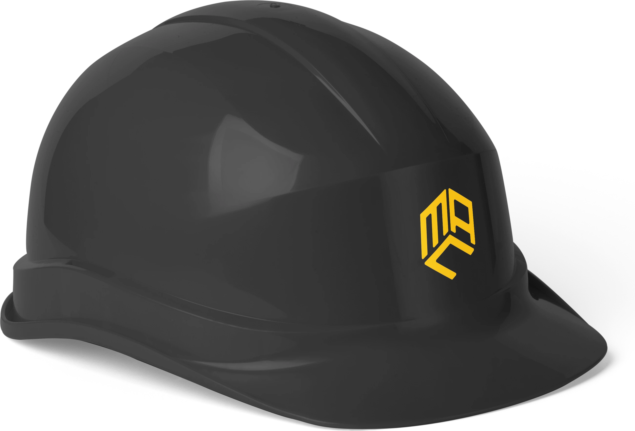
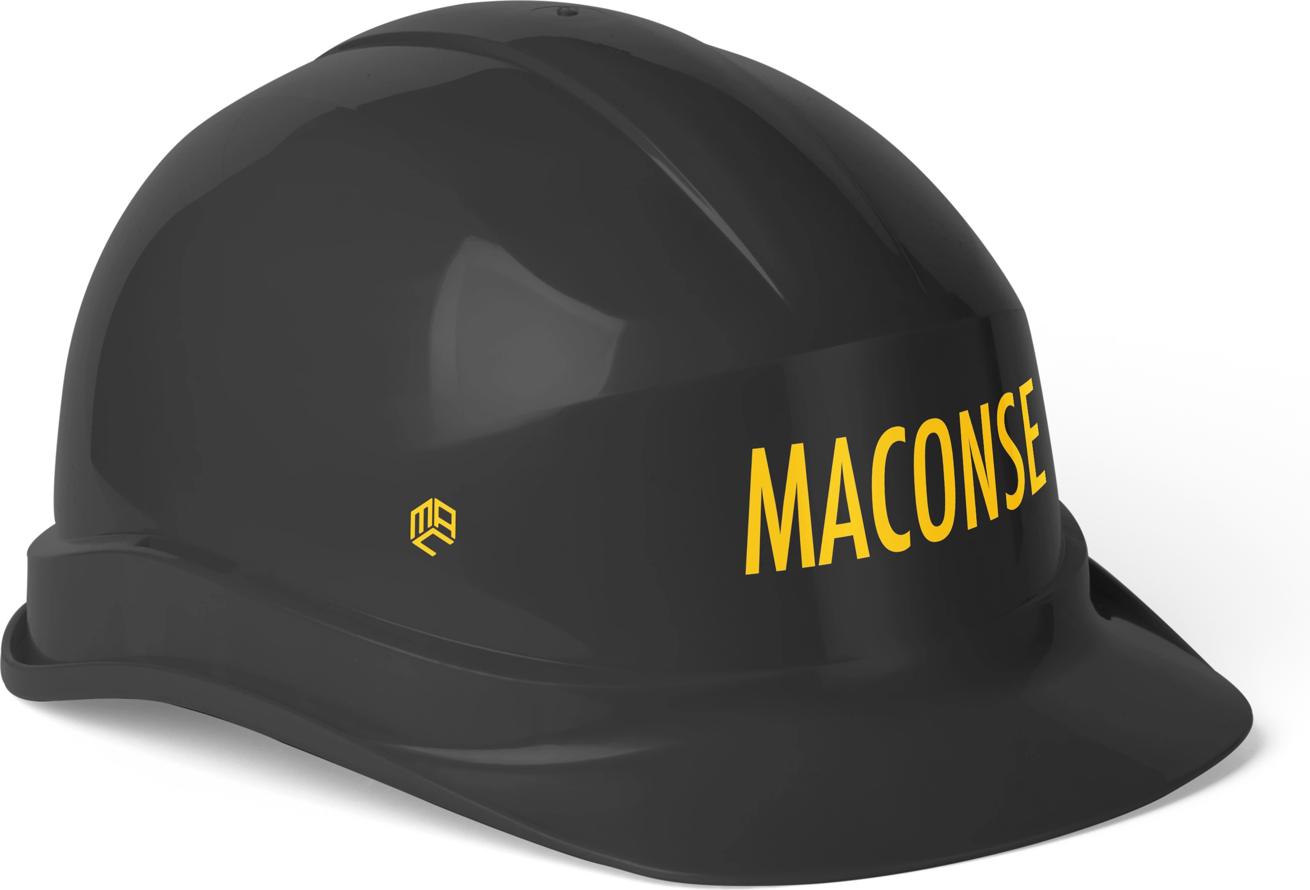
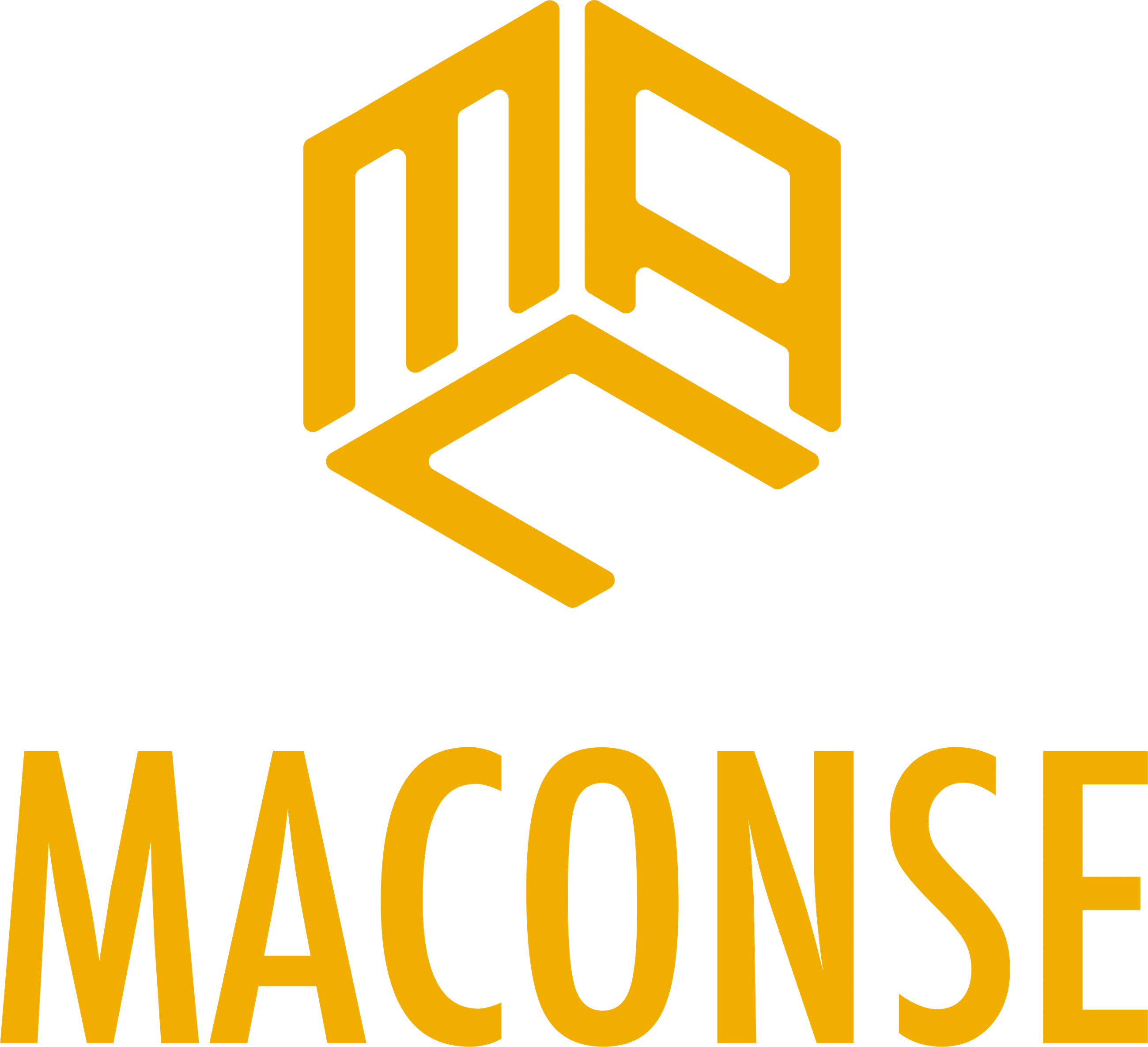
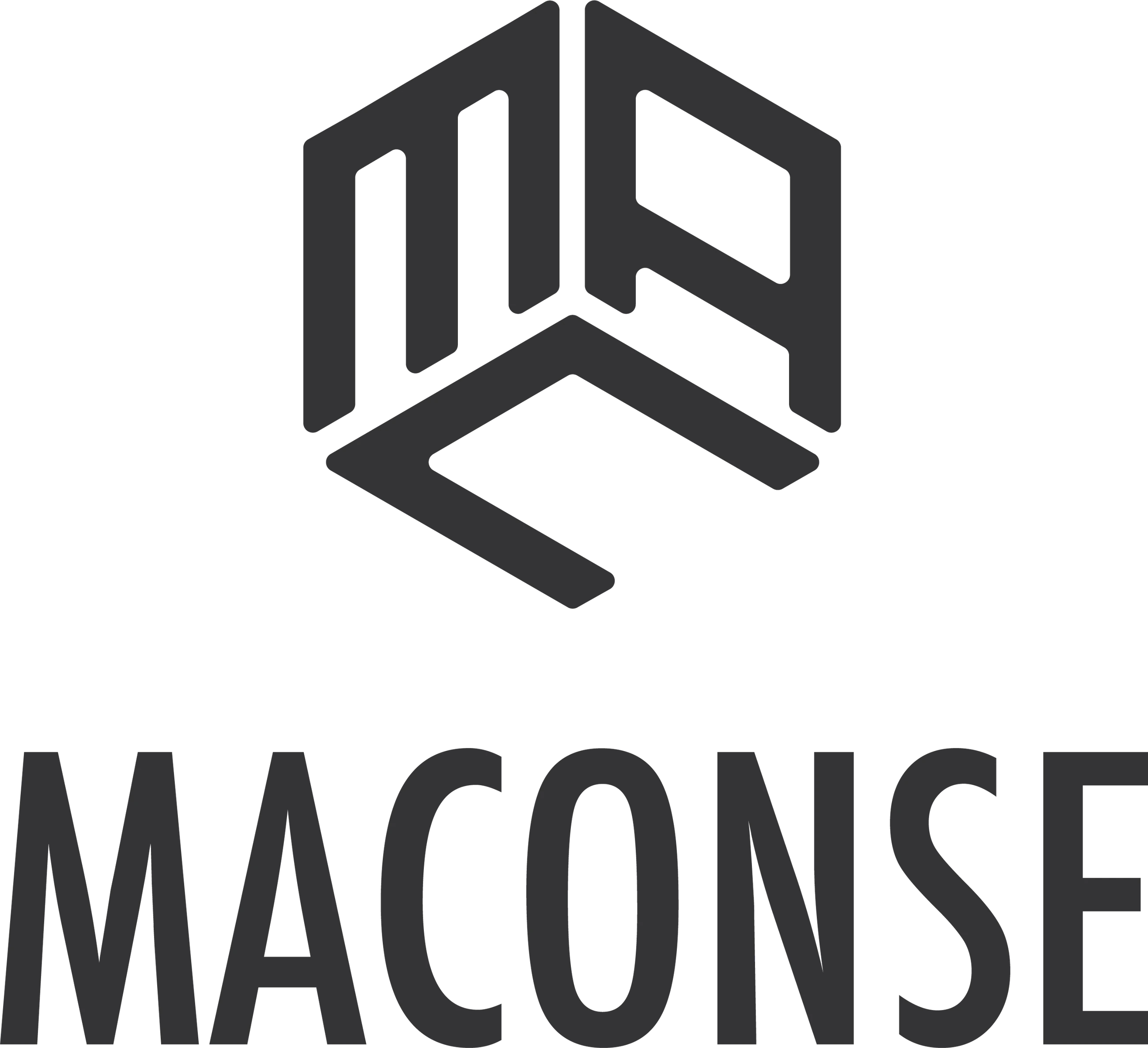
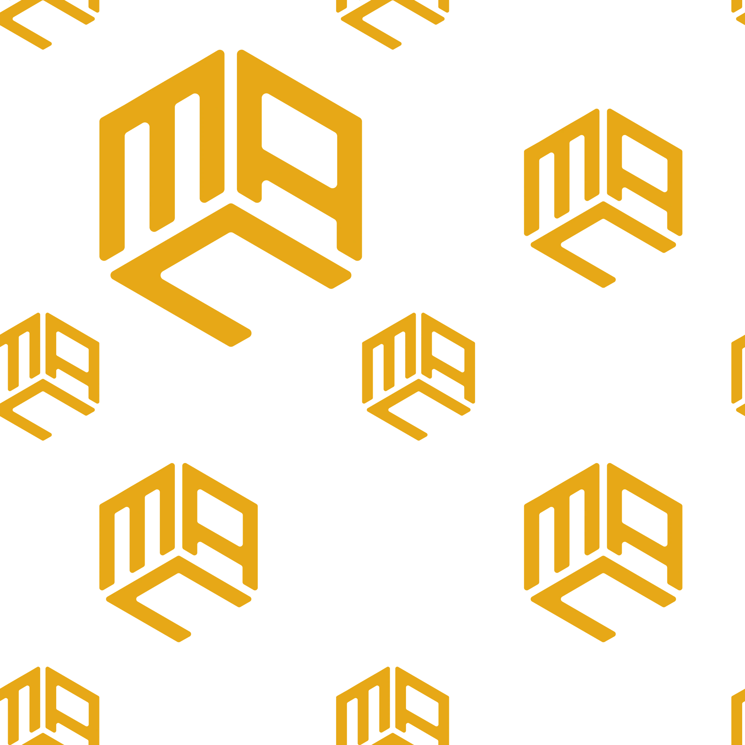
Identity for a maintenance, construction and services company: the initials MAC form a solid cube.
Brand identity
“MACONSE is not just about building projects; it is a paradigm of effort forged over years of experience, marked by exceptional dedication, unmatched efficiency and an unwavering commitment to excellence in every service it offers.
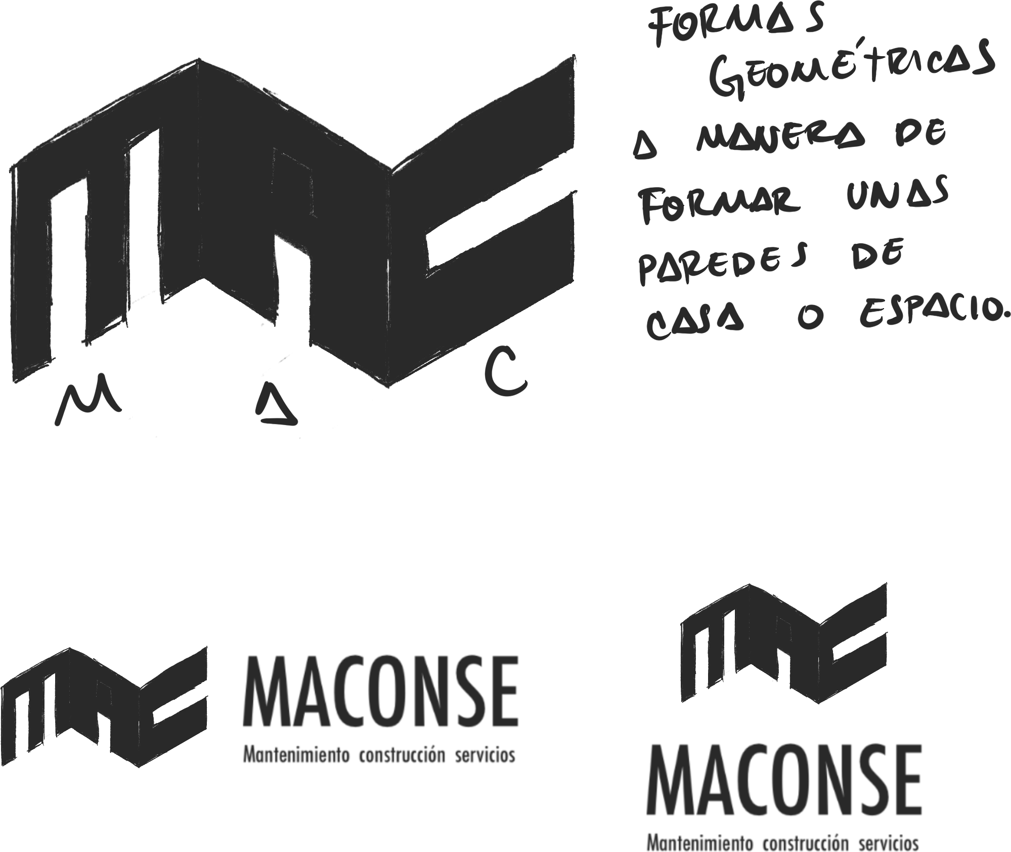
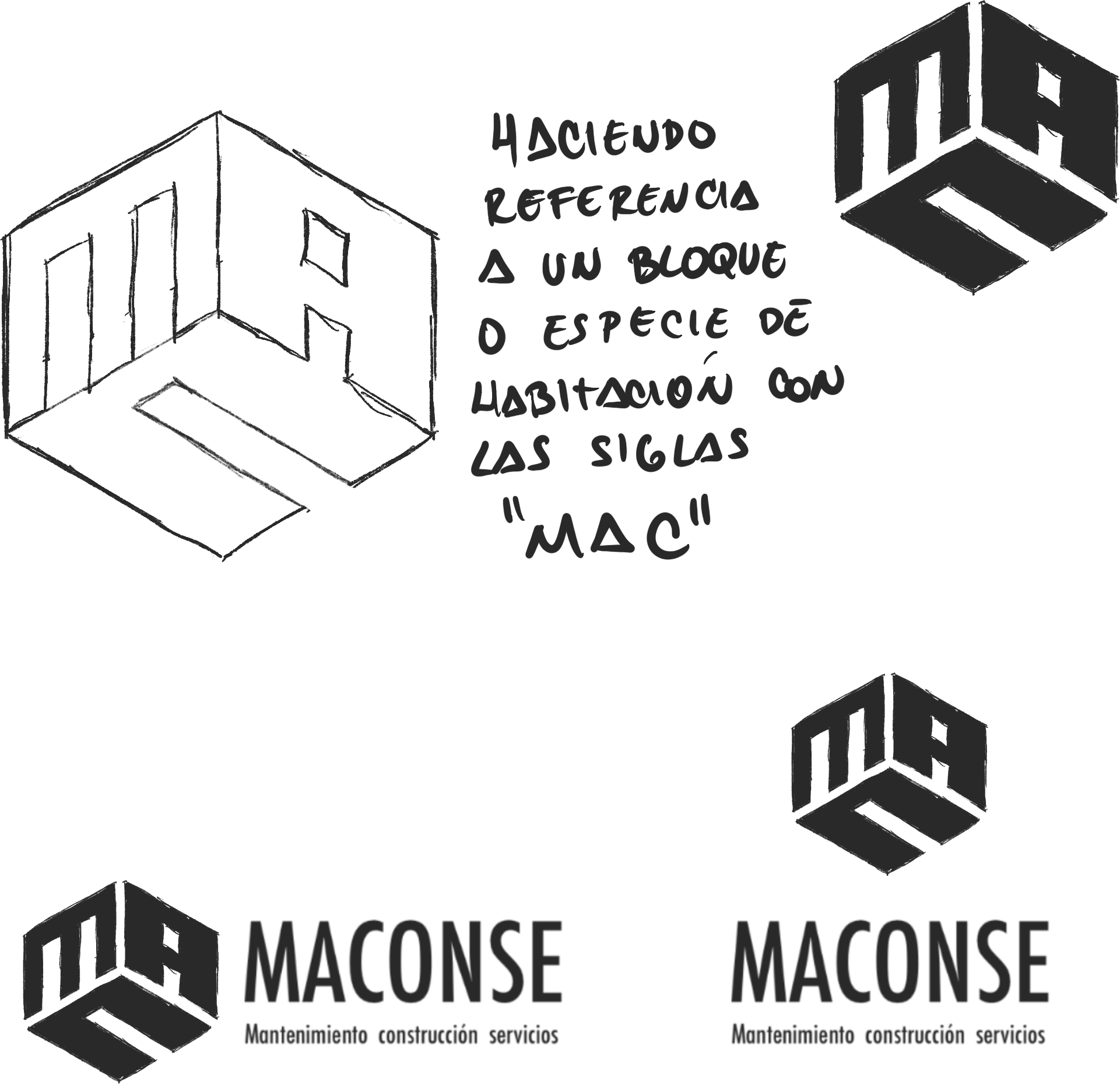
With this premise in mind, its logo design is grounded in the company’s pillars: solidity, seriousness, efficiency and constant, inevitable growth. That’s why we chose a design based on a cube, symbolizing a concrete block built to withstand every challenge and adversity. The name was also simplified to the initials “MAC” without altering the original name, and each letter forms one side of the cube, creating a three-dimensional effect that reflects the essence of the company.”
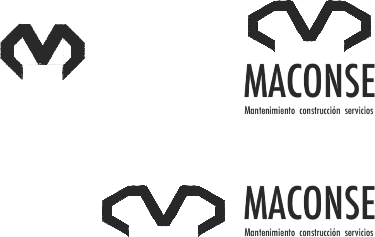
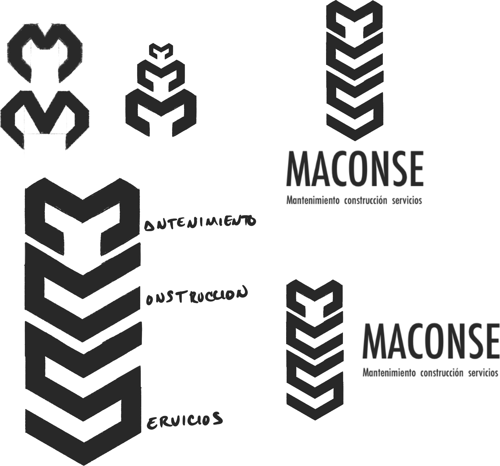
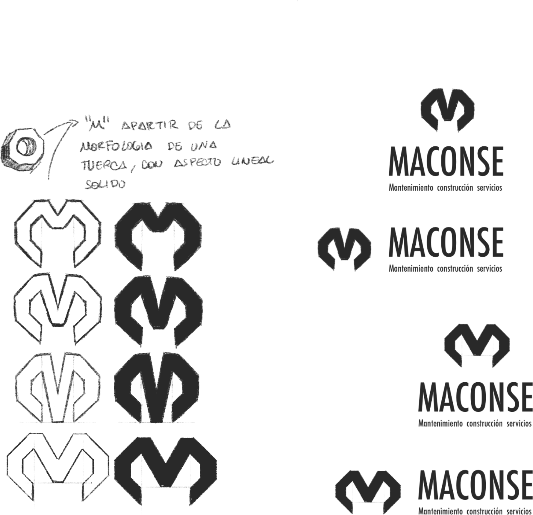
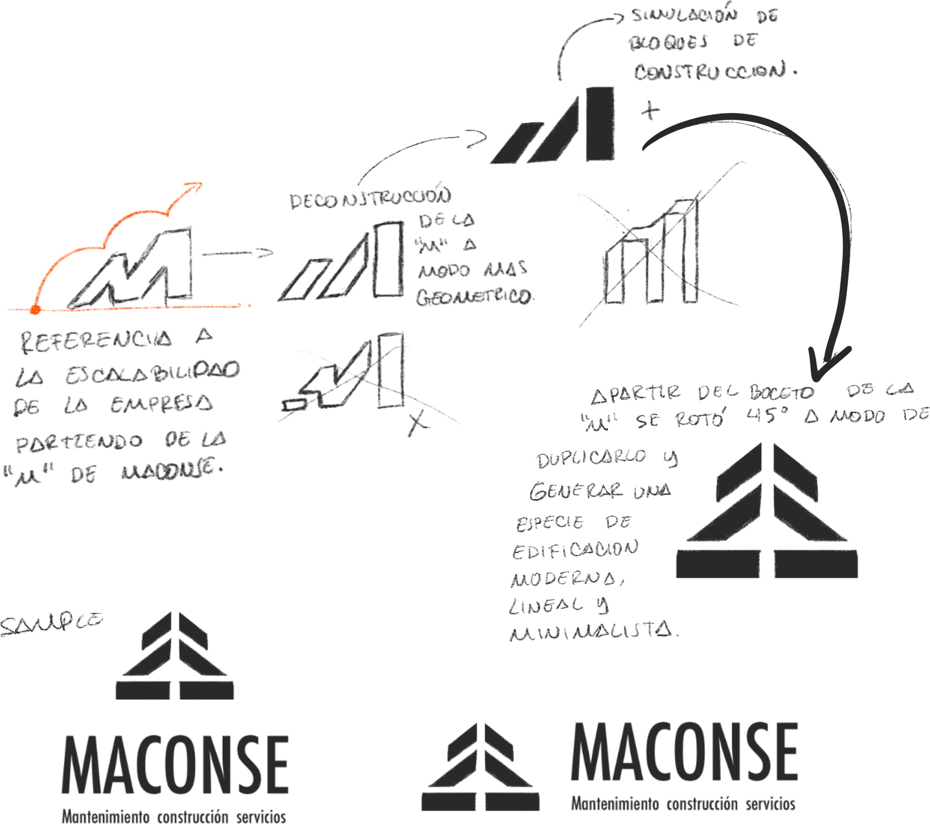
Sketching process


Color palette
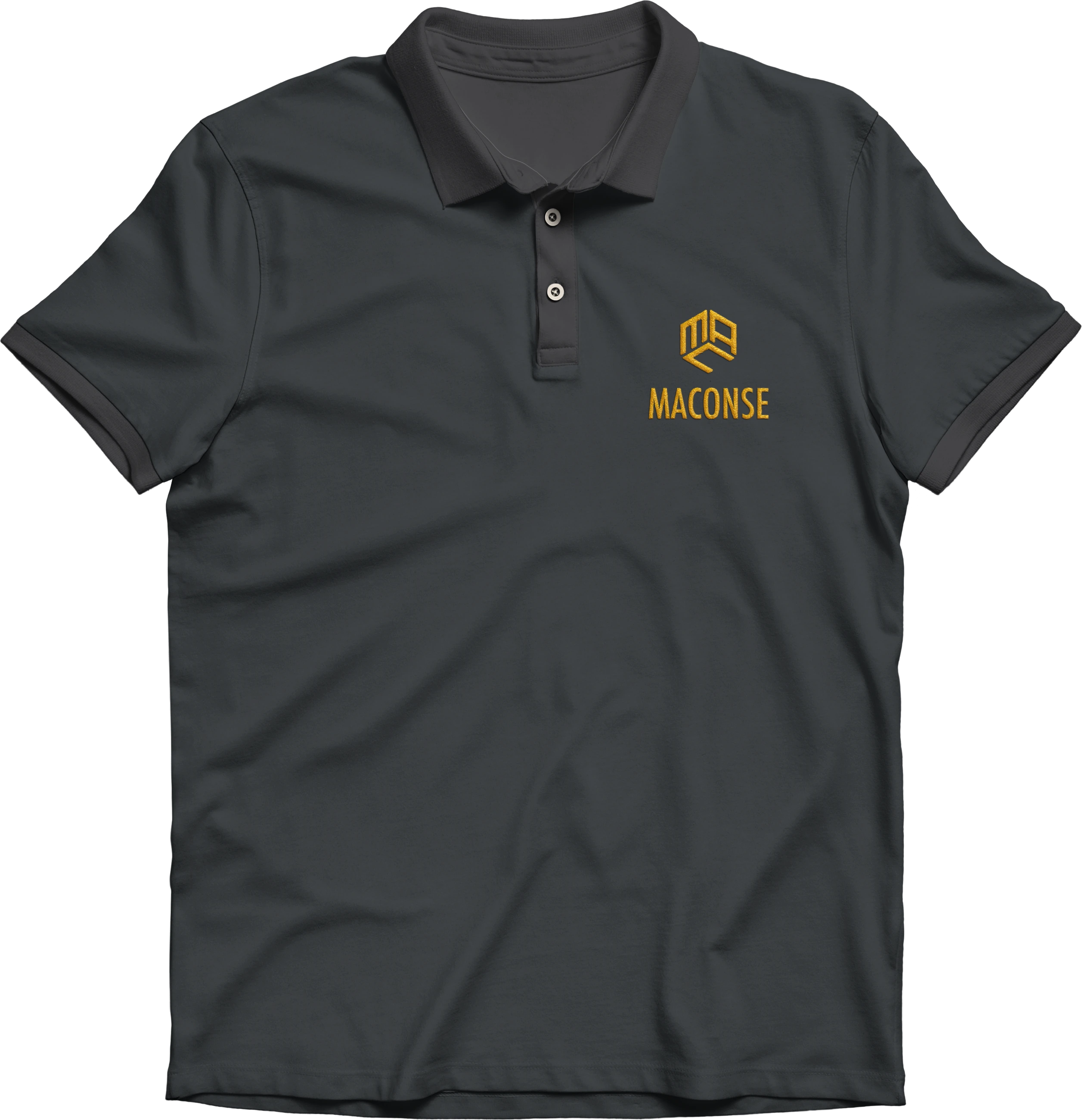
Logo versions




Typography


Visual system
Modular grids, iconography and applications.
Iconography