Branding
Mechanika × Asthronoth
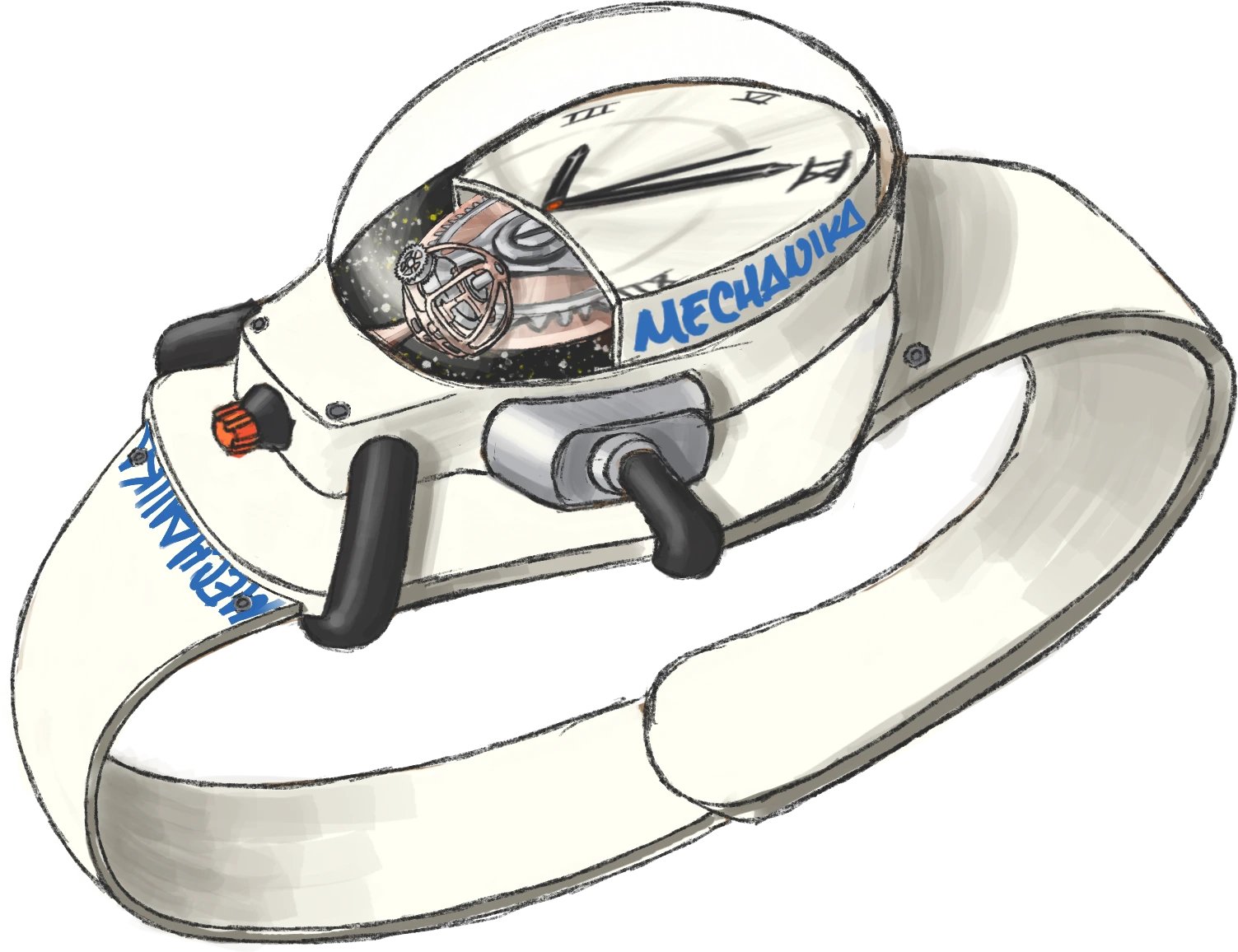
A fictional watch brand that uses the Mechanika typeface as its identity, and its first watch: Asthronoth, inspired by an astronaut suit.
Mechanika
In a vast and mysterious universe, where time manifests as a symphony of hidden gears, MECHANIKA is born: the union of mechanical precision and the grandeur of the cosmos. Each watch is more than fine watchmaking; it is a constellation caught in time, designed for those who understand that true luxury lies in exclusivity, not ostentation.
MECHANIKA isn’t for everyone. It’s for those who see beyond the second and understand that every movement is a journey into the unknown. Whoever wears a MECHANIKA carries not just a watch, but a fragment of the universe on their wrist, created to defy the passage of time.

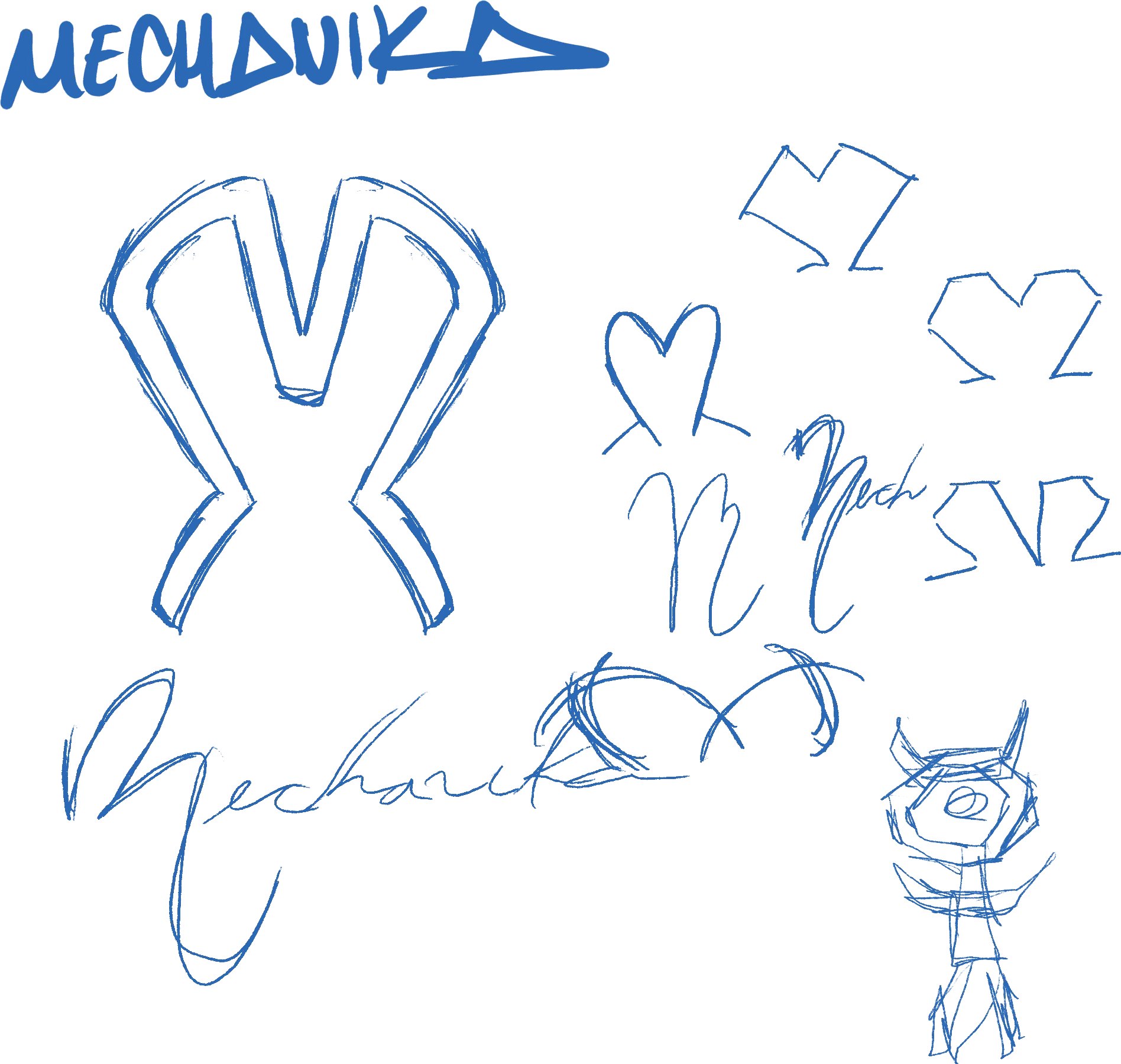
Logo sketches
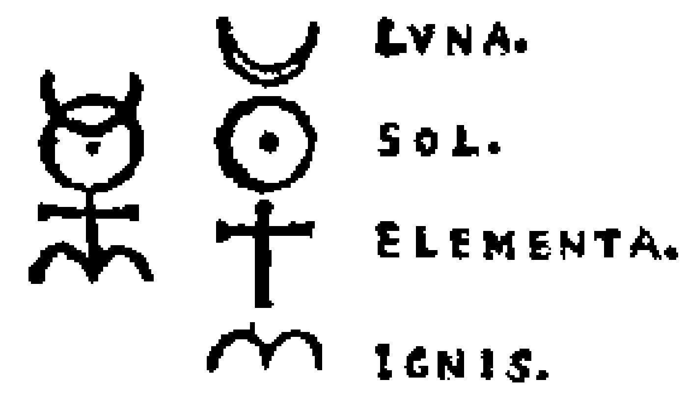
To explain the chosen logo a little more, it’s basically another Monas Hieroglyphica, but in a more finished, symmetrical form adapted to a mechanical context. It builds on the shapes of the parts the letters were made from. I’ll include the original symbol here again, which, in a very brief summary, is made up of the elements that, according to one theory, form the universe.
And well, as you saw in the Zambos packaging design project, here’s the symbol again, redesigned and adapted to this other project; it’s definitely part of me by now —I even have it tattooed— but we’ll leave that for another day.

A quick note
This isn’t a continuation of the previous project. In short, since I thought the typeface project turned out really well, I decided to use that same typeface for this new project: creating a watch at a conceptual and visual level. I thought the best approach was to give the brand its own typeface, just as many of the brands I follow do, with private, exclusive typefaces.
So I used the name of the Mechanika typeface as the name of the fictional watch brand, and renamed the typeface Space so it would also connect with the brand concept, since it’s related to outer space.
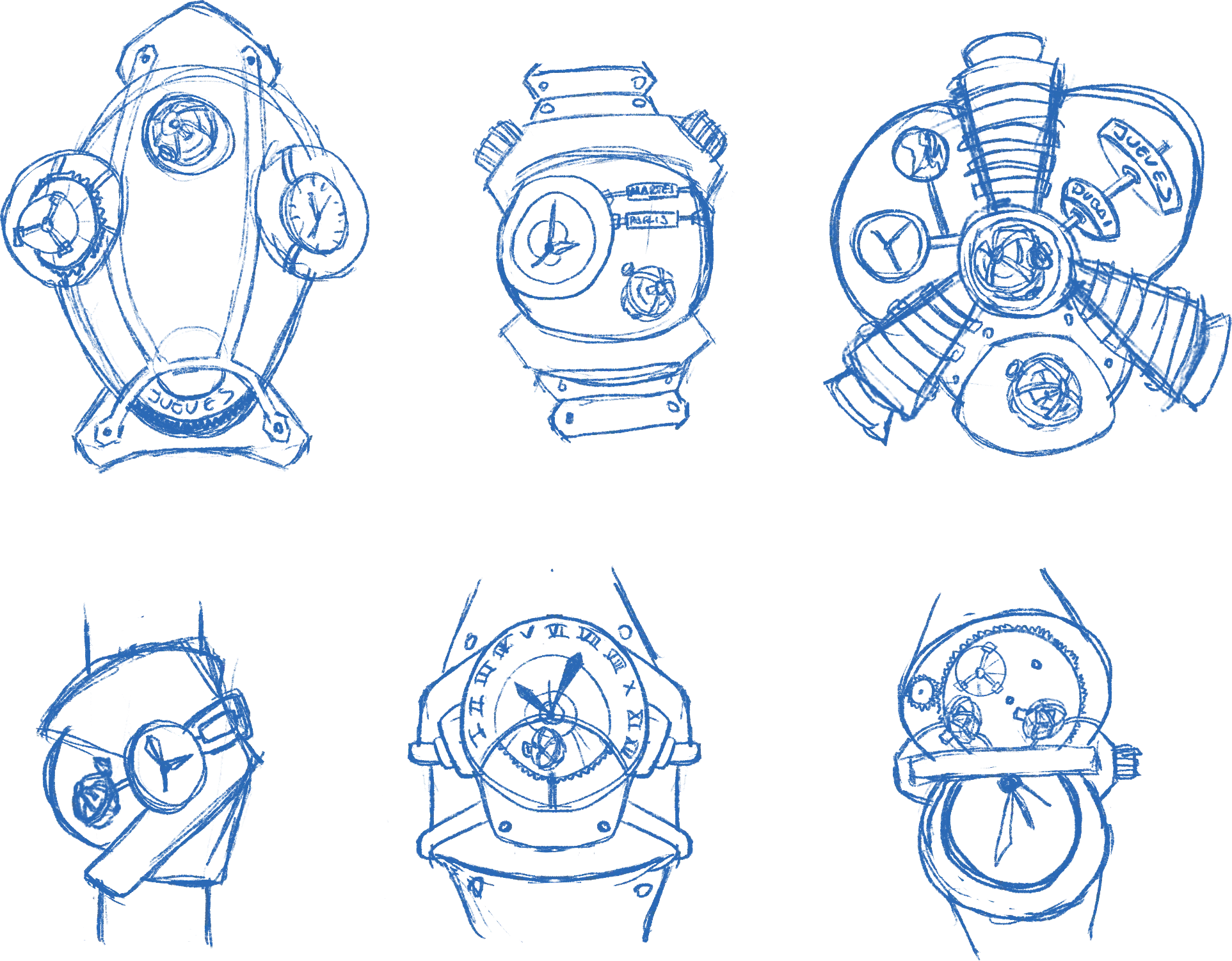
Watch sketches
Inspired not only by the brand I mentioned earlier (Richard Mille), I also looked at other brands such as MB&F, Jacob & Co., Audemars Piguet, HYT, Behrens, Vanguart and URWERK, among others. The selected sketch is inspired by an astronaut suit, so the whole theme revolves around it.

Modular grid sketches










Other graphic elements: graphic style and illustration finishes





Packaging and straps
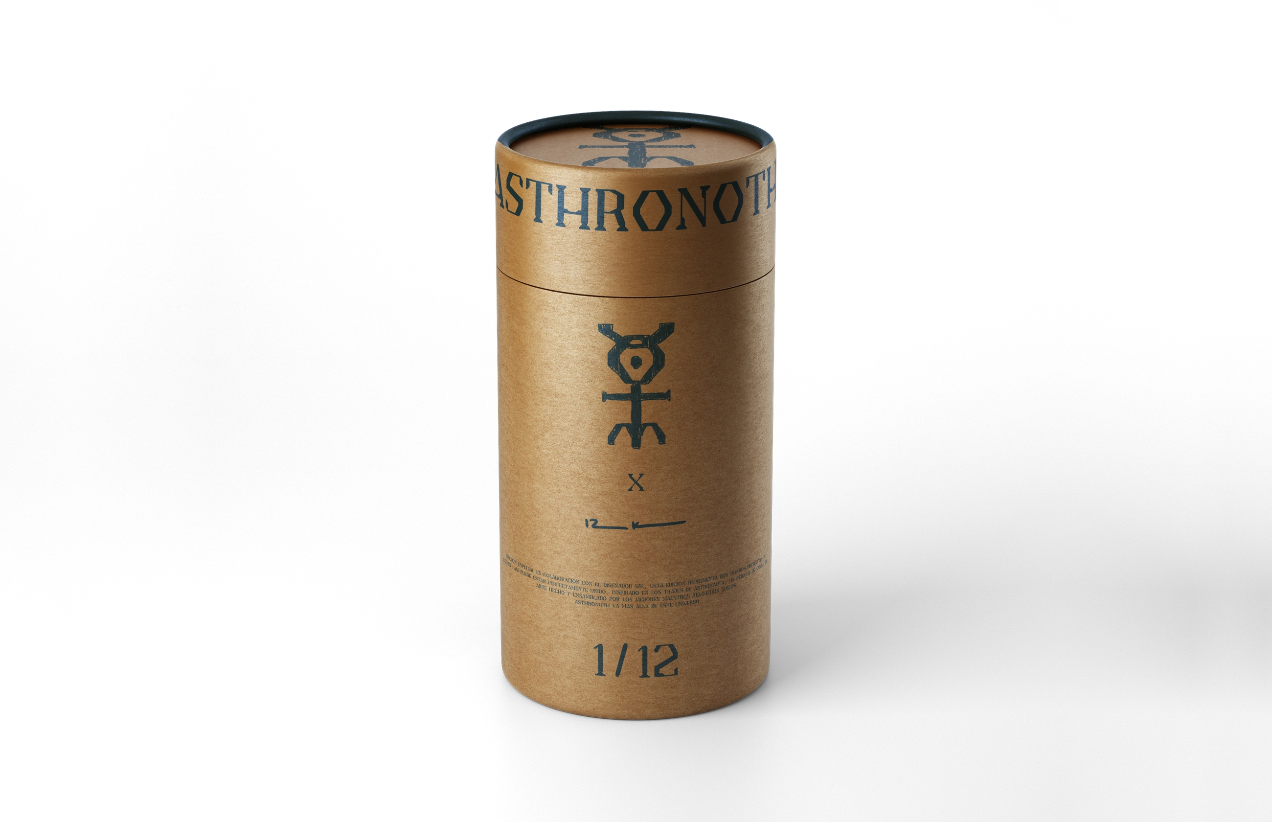
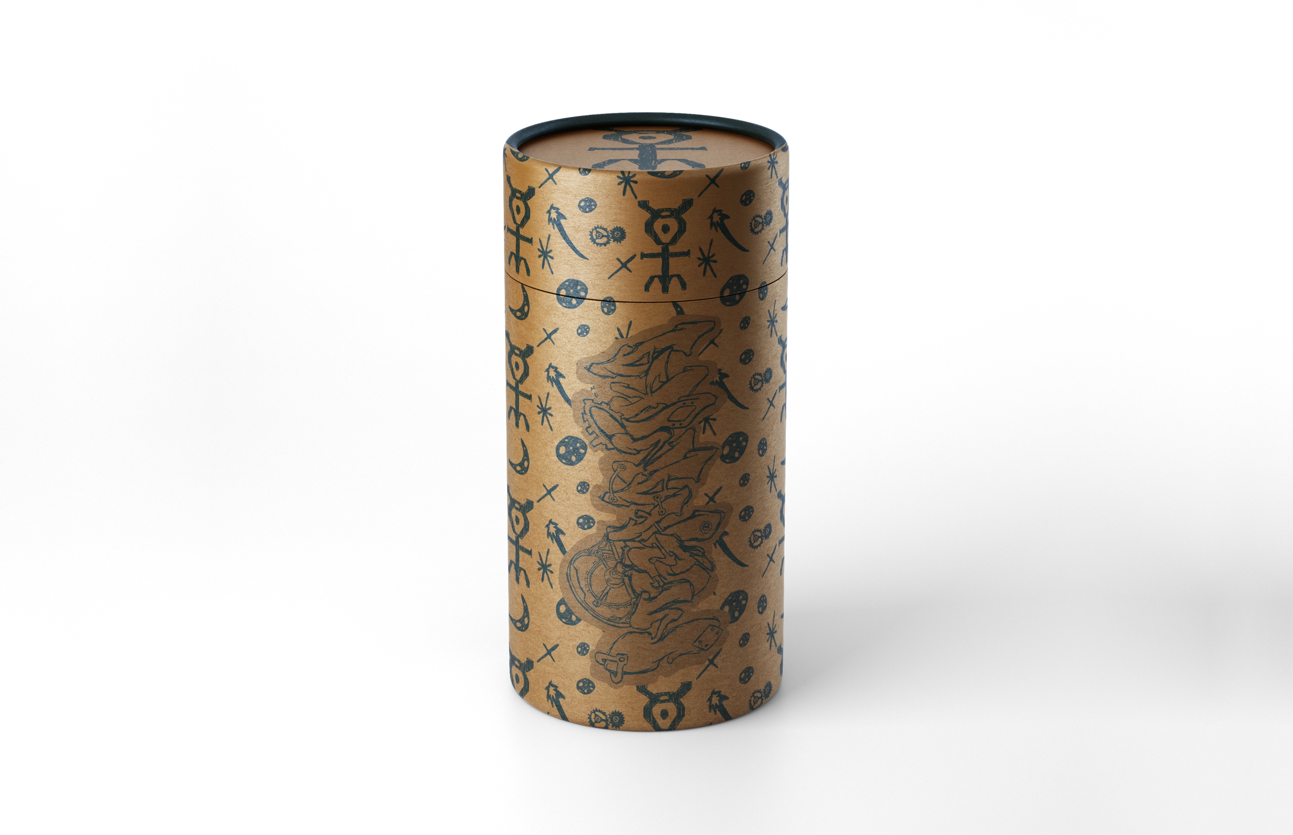
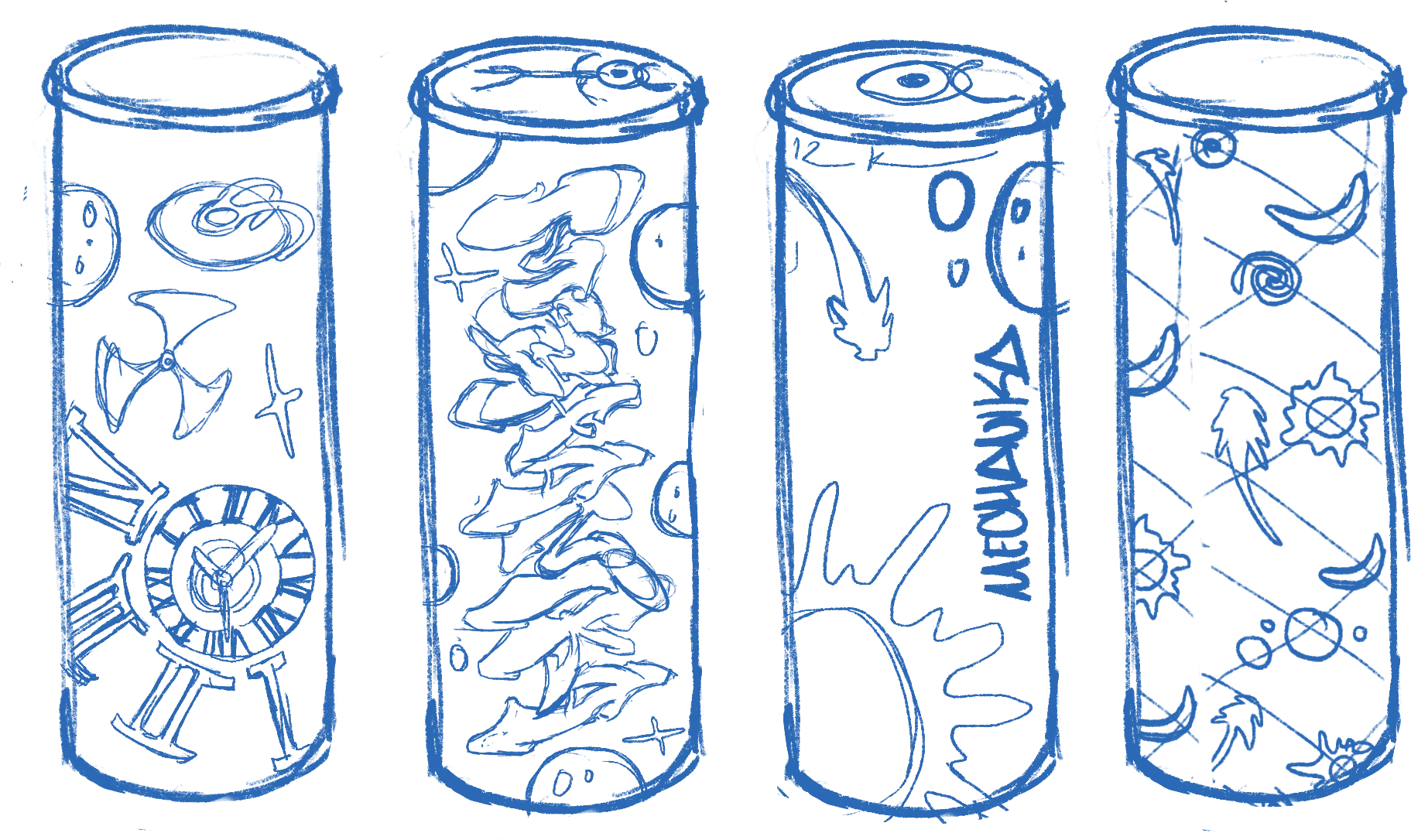
For this packaging design, what I’ve basically shown is a kind of compressed cardboard tube that represents a space capsule, with a short description saying it’s a limited edition of 12 pieces because the brand did a collaboration with me —hence the number. It also shows the name of the watch: ASTHRONOTH.
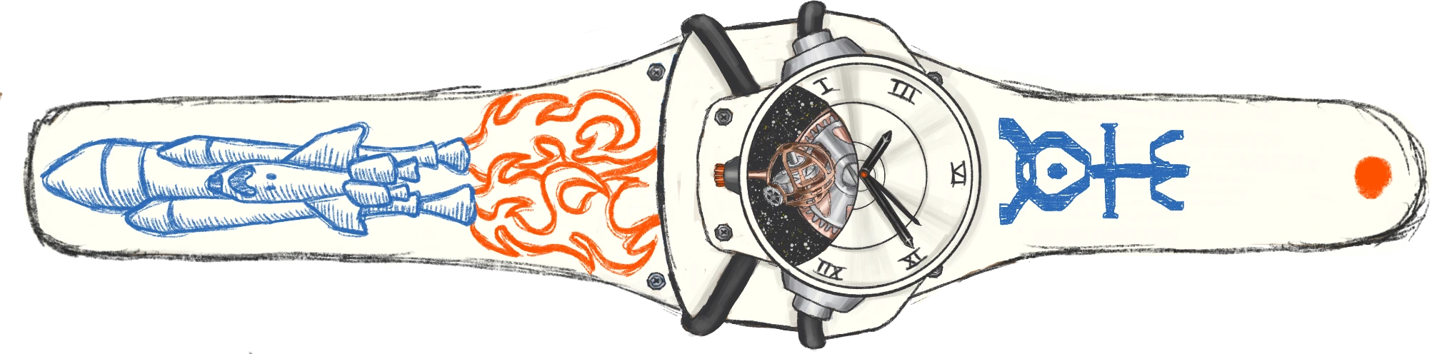
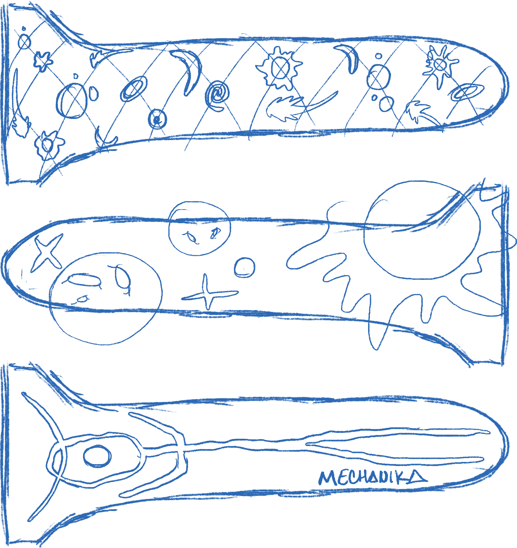
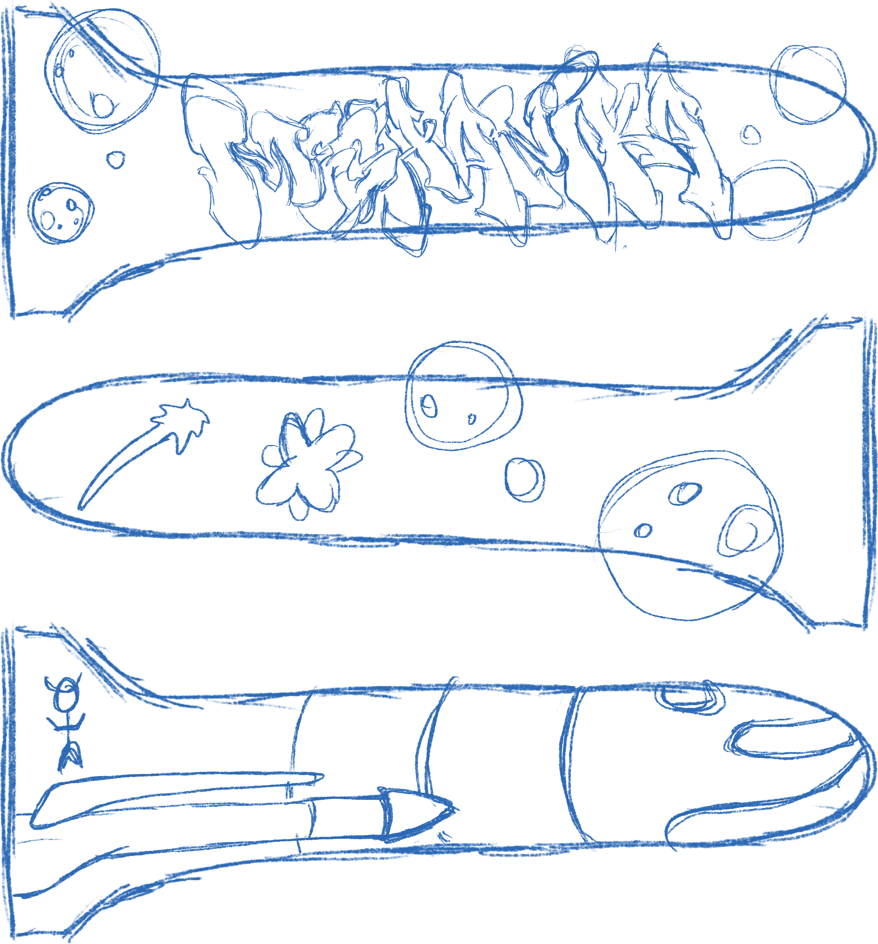
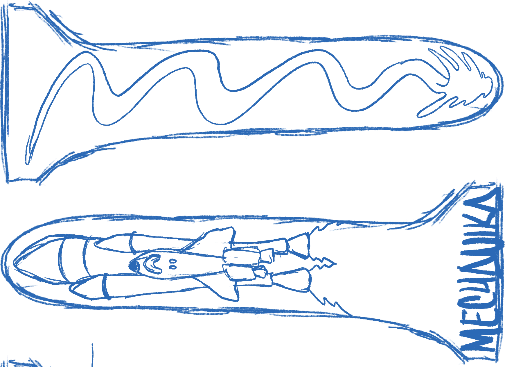
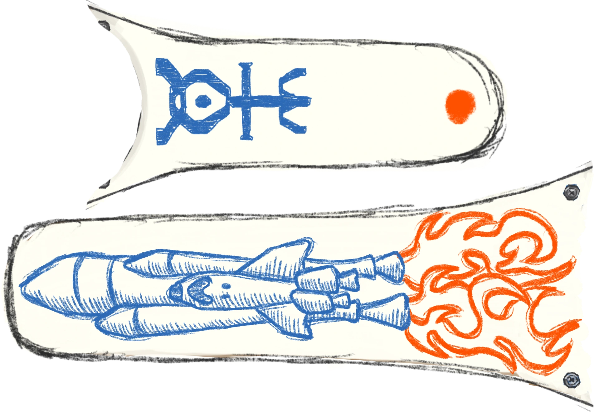
Next, the strap design is an illustration in a linear style, echoing the packaging, so it matches and contrasts with the tones chosen for both the rocket and the fire. The goal is to make it clear that this piece has been artistically customized.
The watch
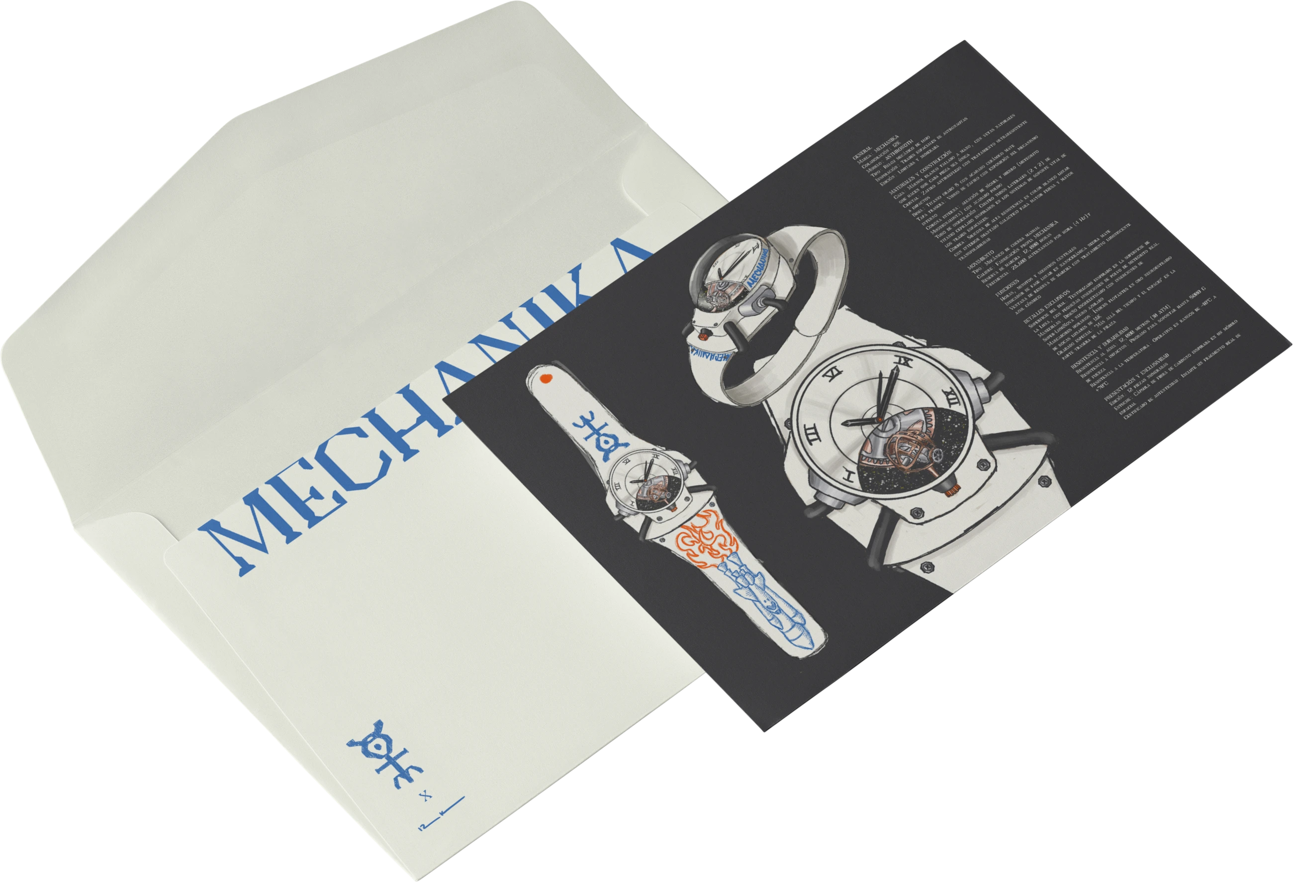
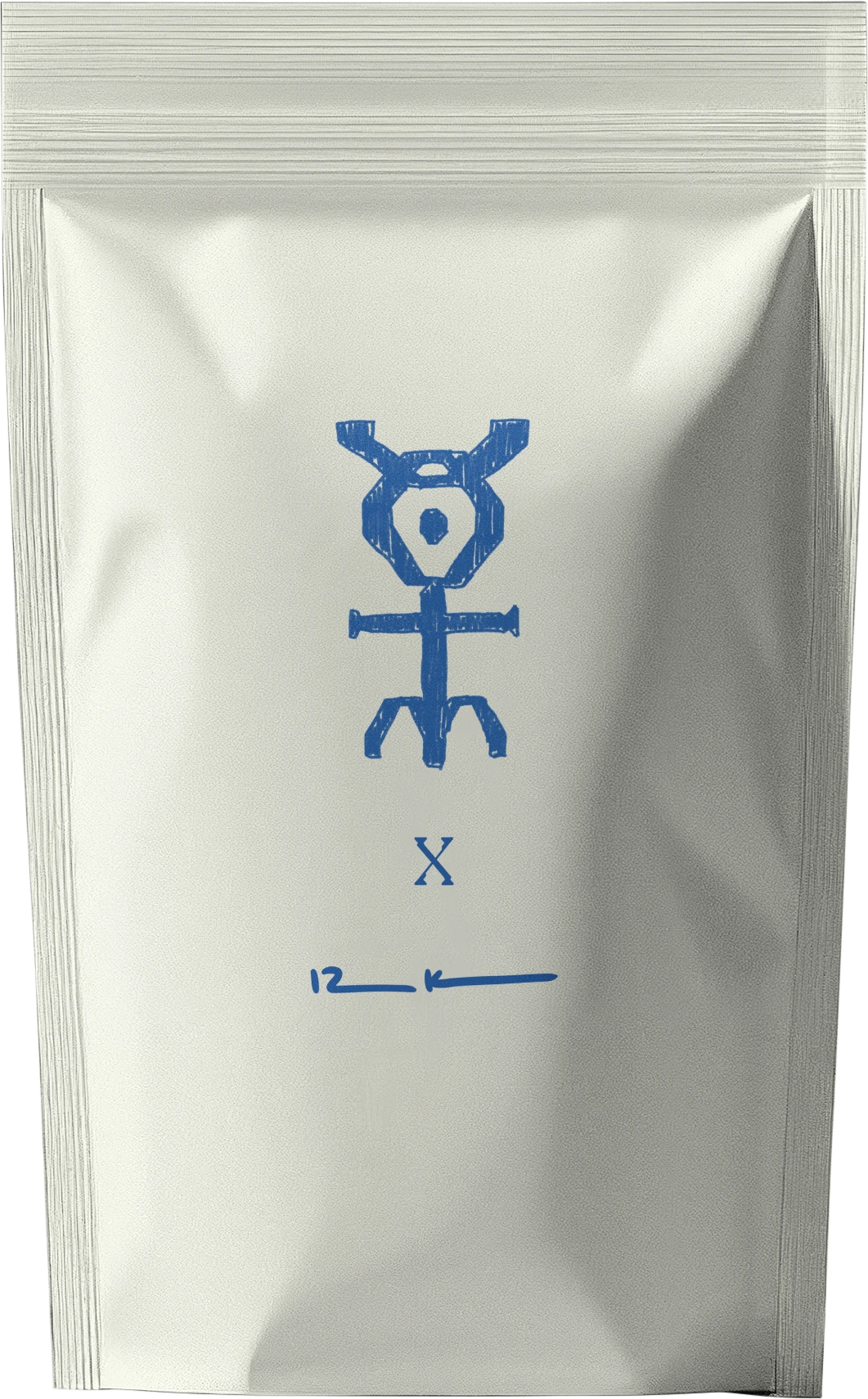
This proposal includes a certificate of authenticity to document the rare materials used to build the piece. It comes with its packaging: a cardboard tube in which the watch is encapsulated, followed by the certificate inside an envelope. This pouch references the kind of packaging astronauts use to carry their belongings or food on a real space mission.