Graphic design
Bruno and the Little Pigs
A reinterpretation of The Three Little Pigs as an illustrated children’s book, in which the wolf becomes the good guy of the story.
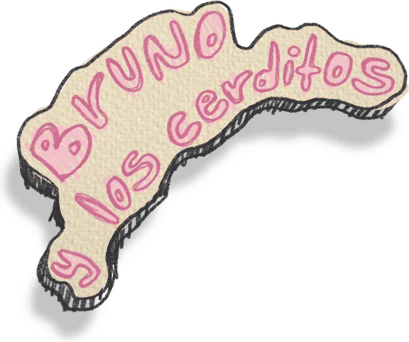
A reinterpretation of “Bruno and the Little Pigs”
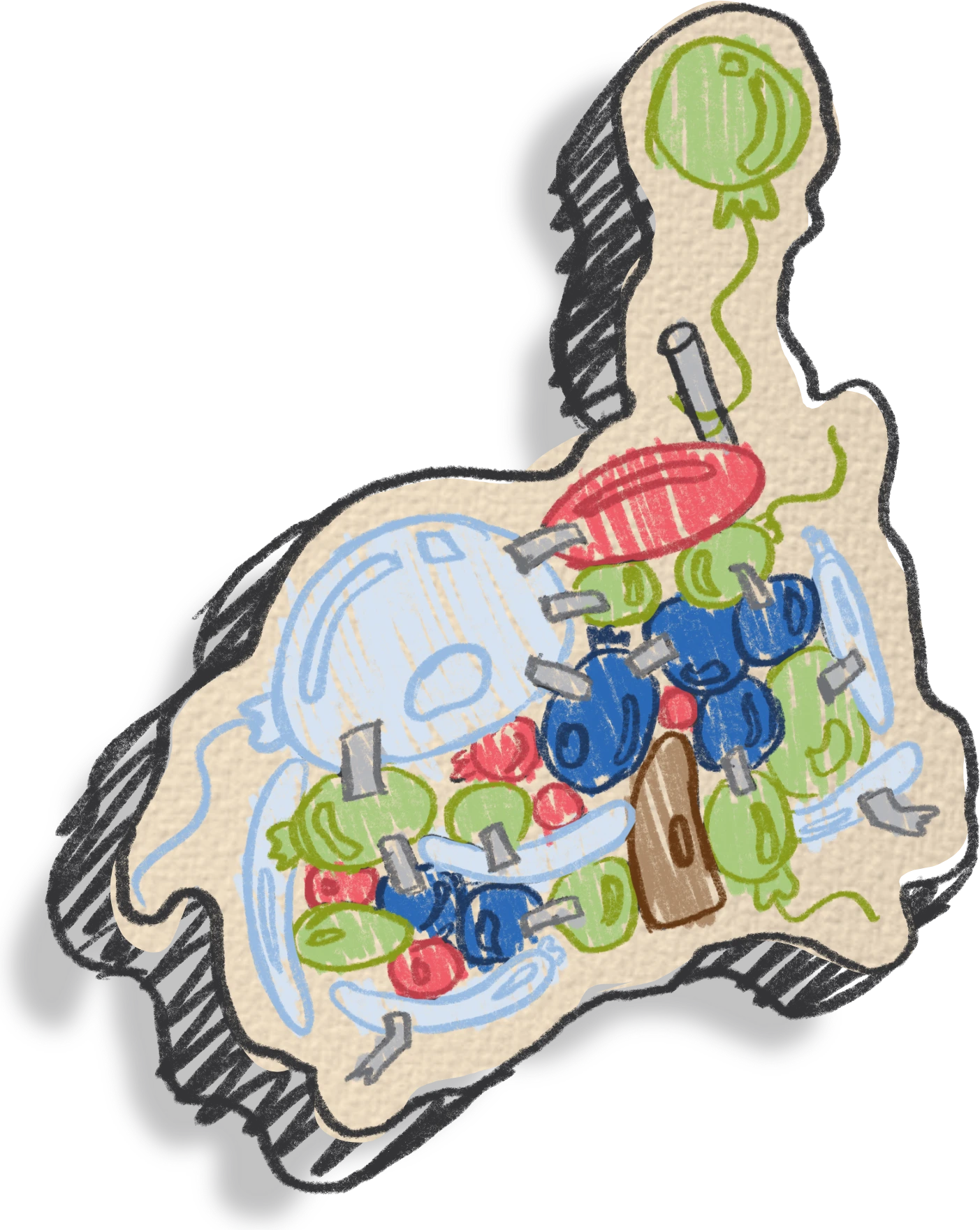
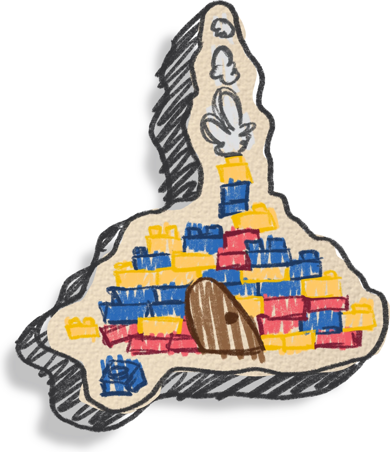
Once upon a time there were three little pig brothers: Chispa, Royer and Toby. Each had a different idea about how to build his home. Chispa was the fastest and the laziest. He built his house out of giant helium balloons. “If the wolf blows, my house will just float away and I’ll be safe,” he thought. Royer, the most playful, built his house out of stacked Legos. “If the wolf comes, I can play and distract him,” he said proudly.
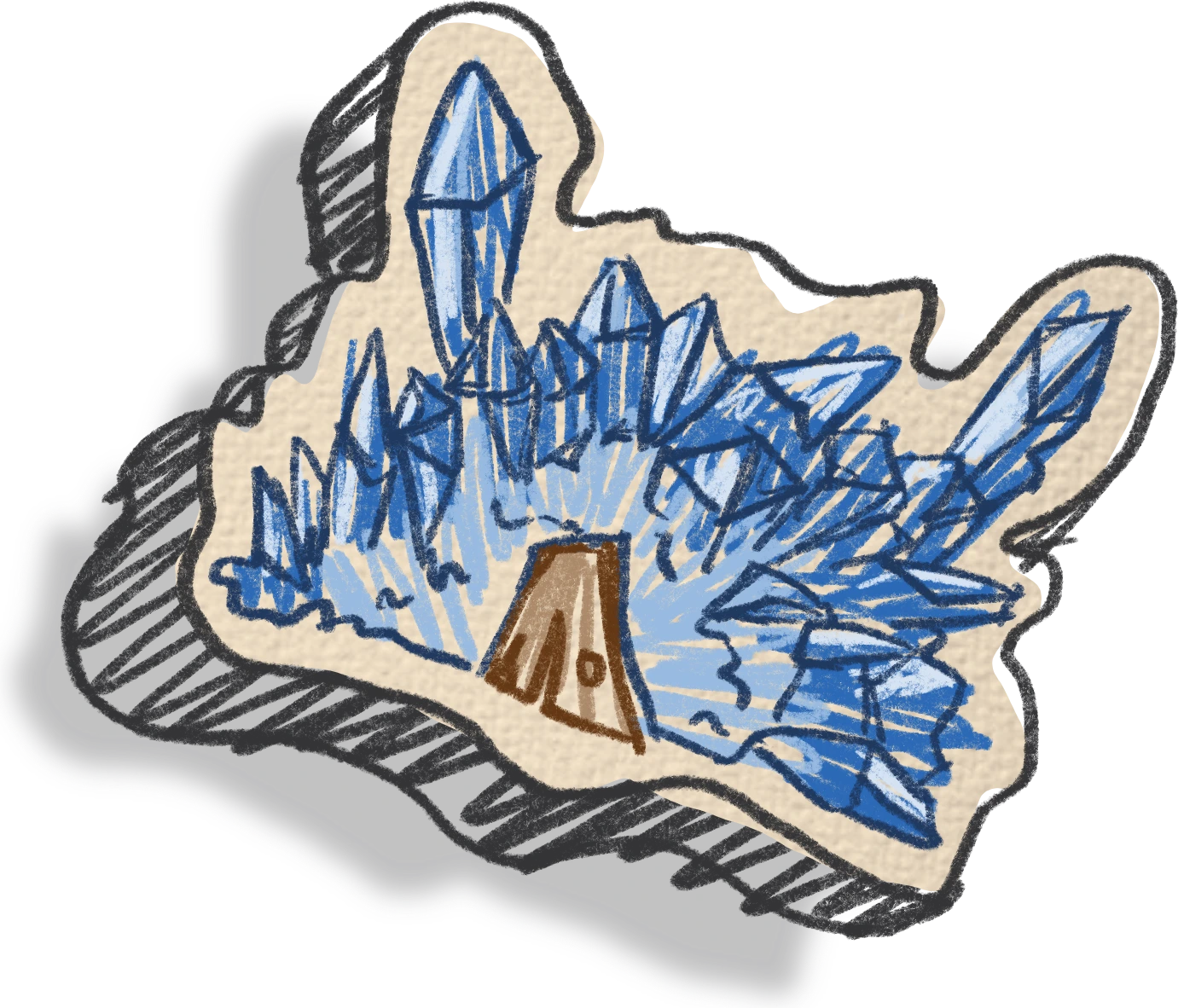
Toby, the wisest, built his house out of reinforced glass blocks. “It will be sturdy and full of light. Nothing will knock it down,” he explained. Bruno the wolf, who wasn’t bad but clever and mischievous, and who loves jumping around in his favorite boots, decided to put the houses to the test.
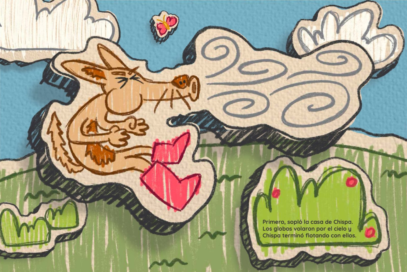
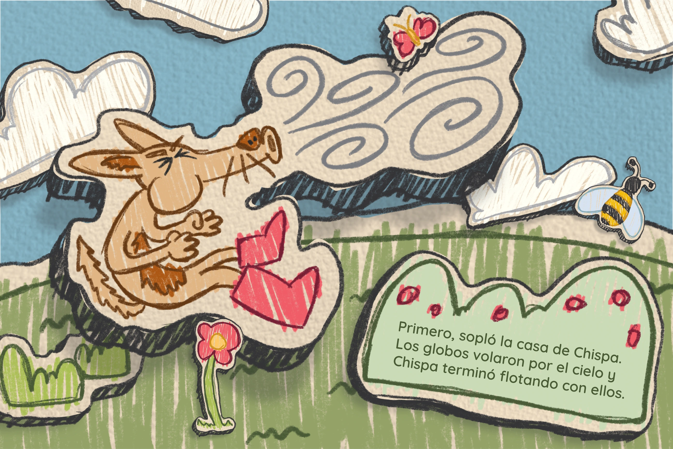
First, he blew on Chispa’s house. The balloons flew off into the sky and Chispa ended up floating away with them. Then he jumped on Royer’s house, but the Lego pieces withstood Bruno’s jumps!
The two little pigs didn’t run anywhere. Bruno didn’t blow down Toby’s house or try to knock it over. Instead, he knocked on the door like a normal person and, when Toby peeked out, he said: “Boooo! I’m a ghost! Let me in!” he shouted. But Toby had a surprise: he came out wearing a sheet and scared Bruno.
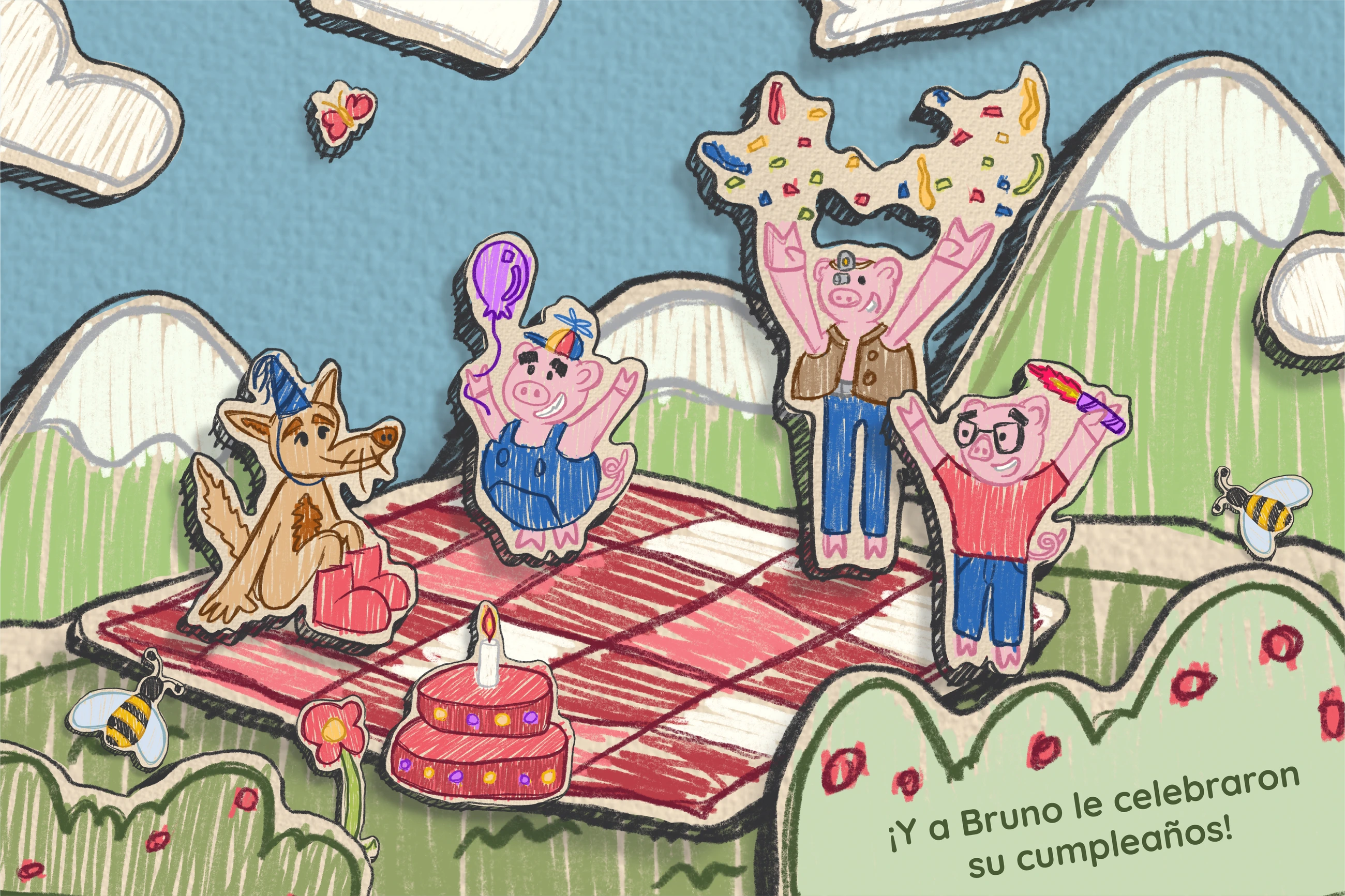
The three little pigs laughed, opened the door and offered Bruno a cake. “You didn’t need to scare us, we could have invited you from the start,” they said. From that day on, the three little pigs and Bruno the wolf became friends. And they threw Bruno a birthday party! THE END.
Elements
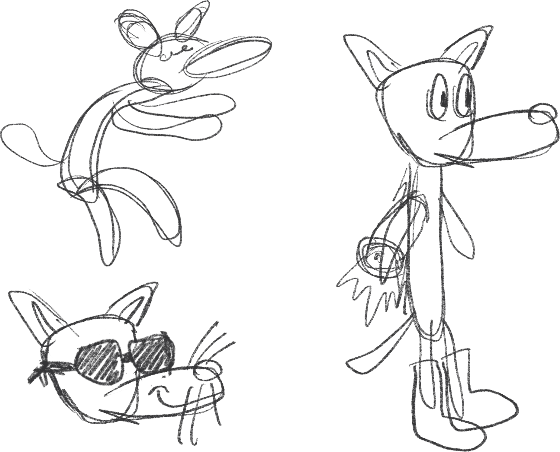
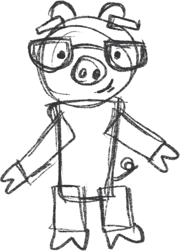
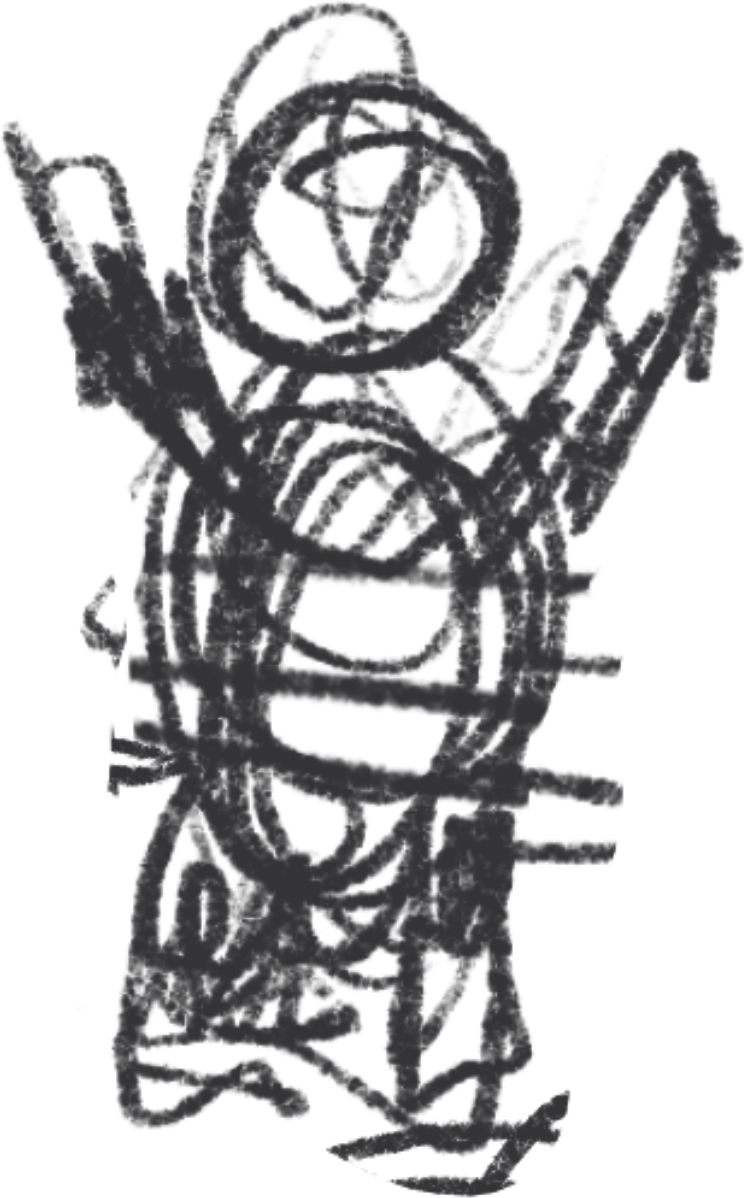
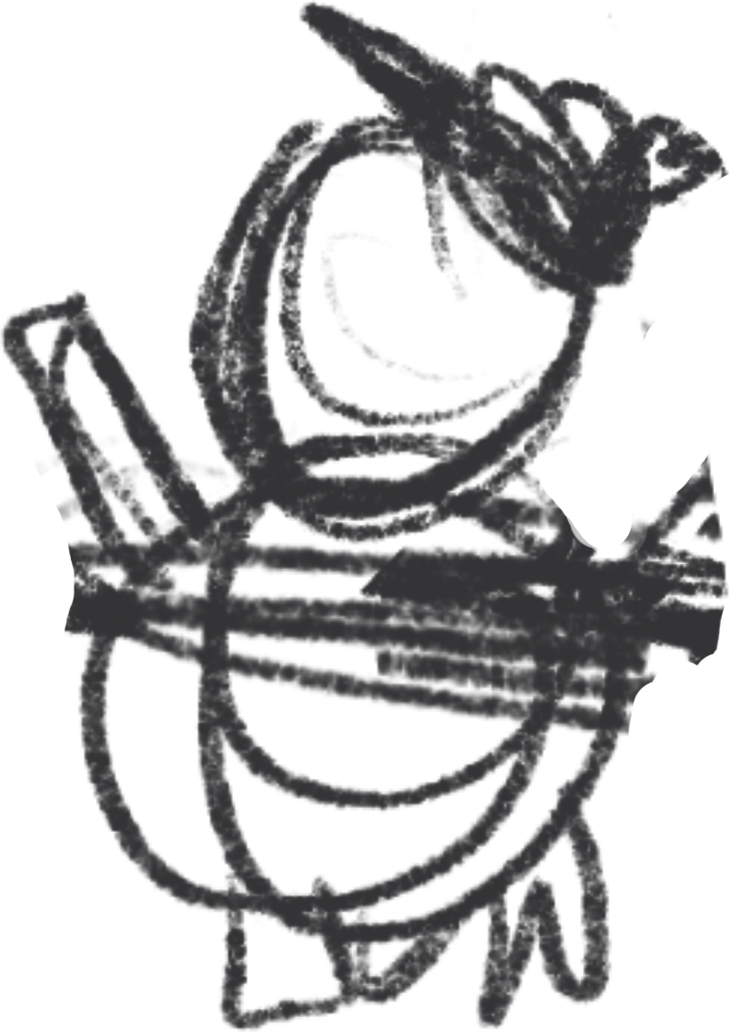
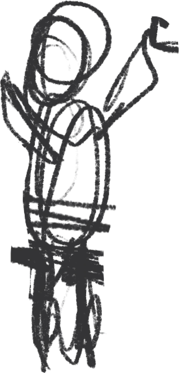
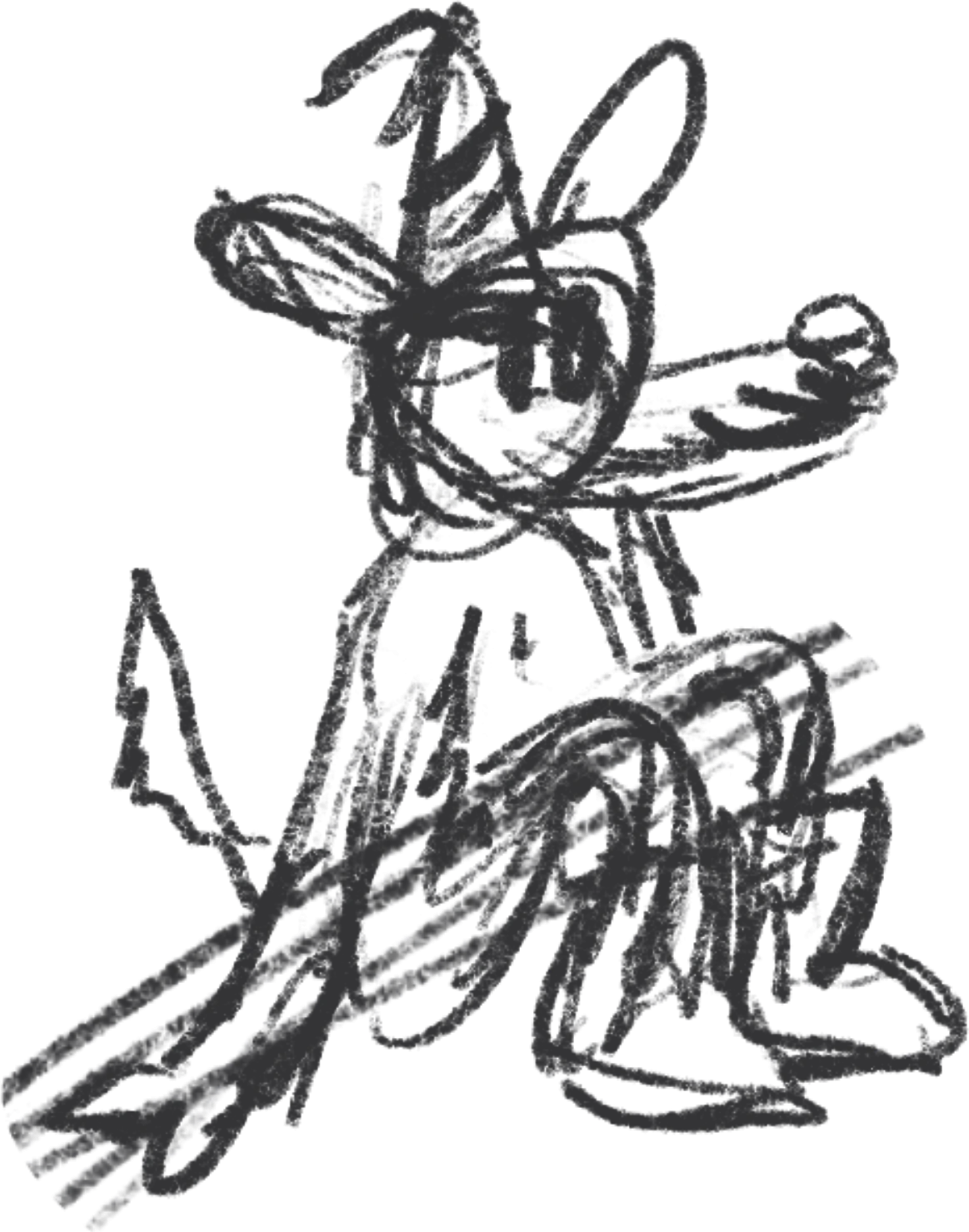
Character sketches
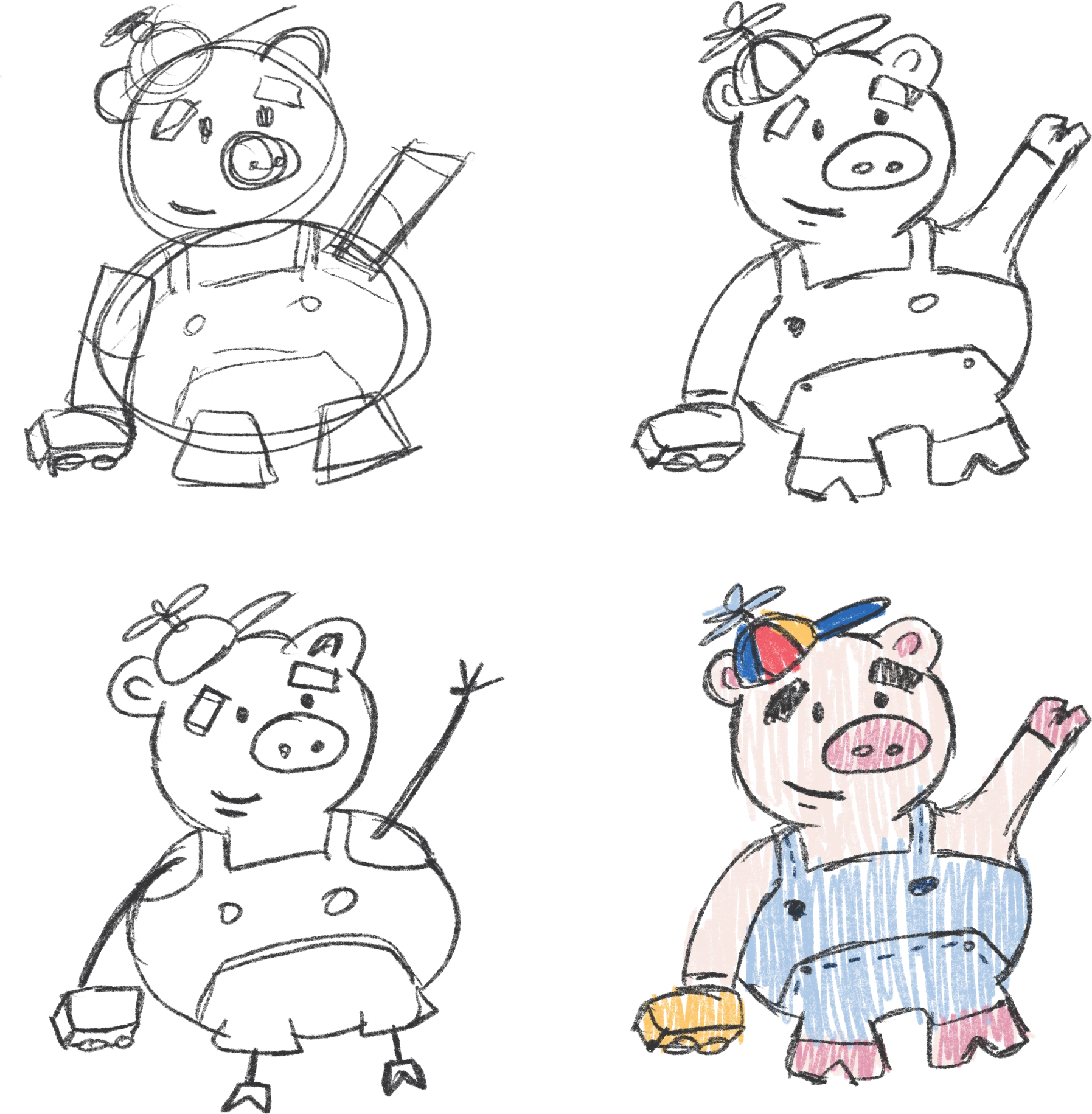
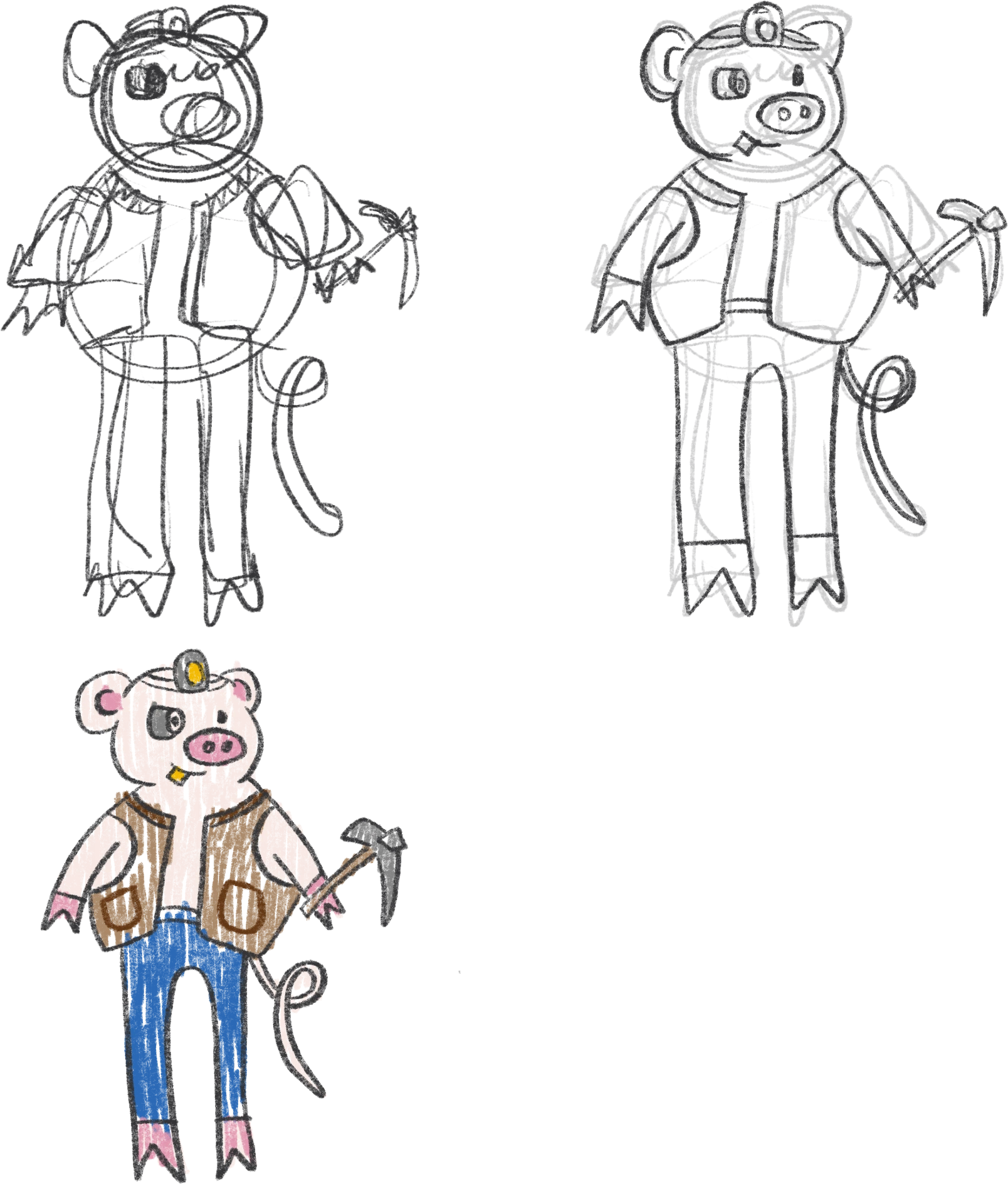
To give a bit of context, the idea behind this tale is to see it differently, always in a positive light, since the target audience is always children. With that in mind, the wolf above all was reimagined: from being the villain of the original tale, he becomes the good guy of the story.
We experimented with geometric shapes for each one to give the characters more personality, and they were also given new names. Three scenes, two endpapers, a product, a front cover and a back cover were also added to the exercise.
Typeface choice and the endpapers explained
In this kind of project you have to think about many things, not just how the little drawing will look in color and that’s it.
Everything has a process and a reason, and part of that is choosing the typeface. I used the “Quicksand” family because its rounded terminals make it pleasant for children to read. This project is designed for children, and so is everything around it. Even details you wouldn’t imagine, such as aspects of the character illustrations and more, were made with that intention.
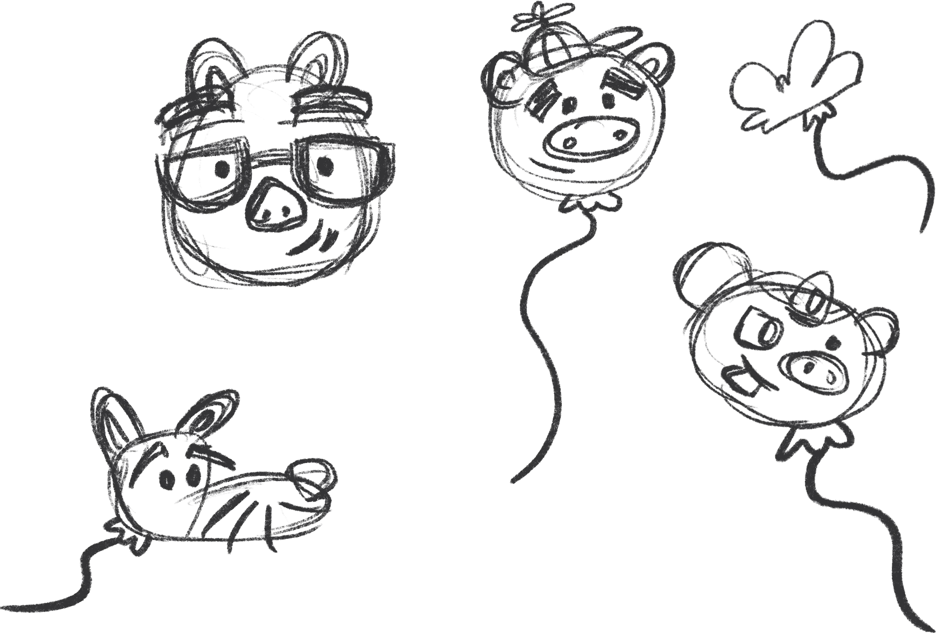
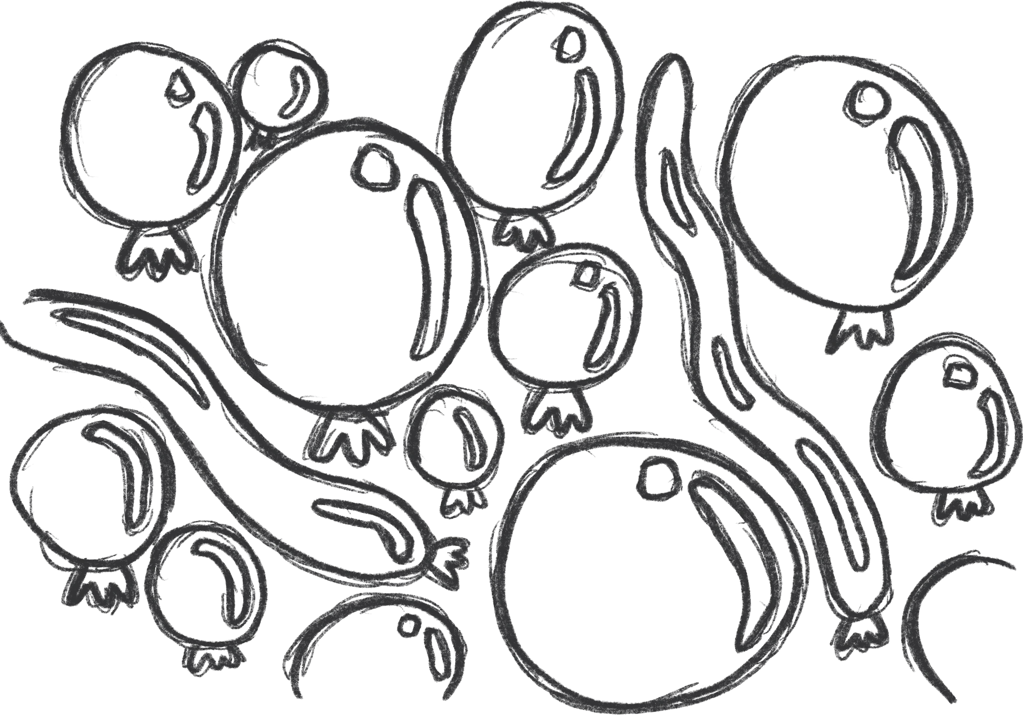
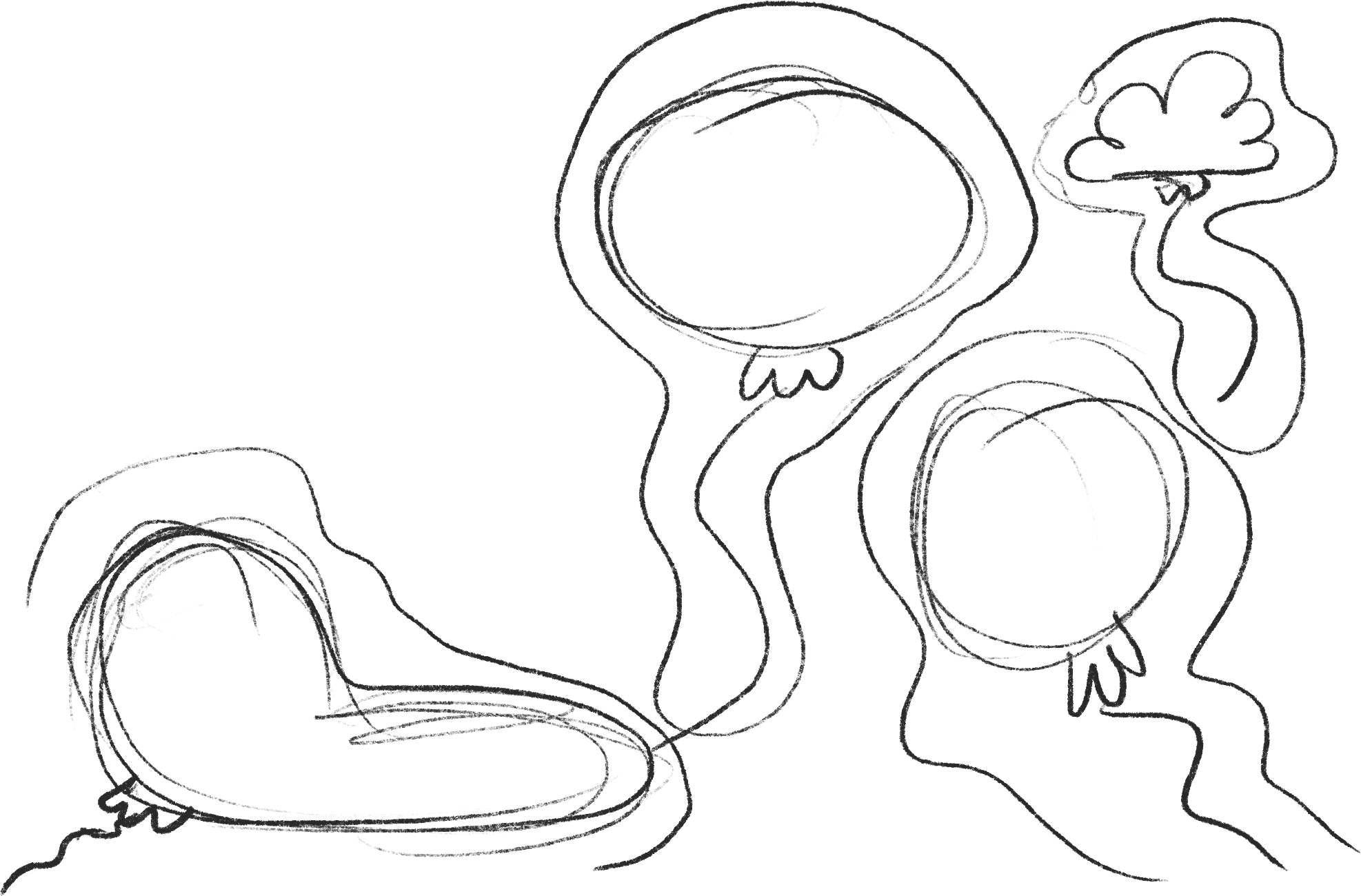
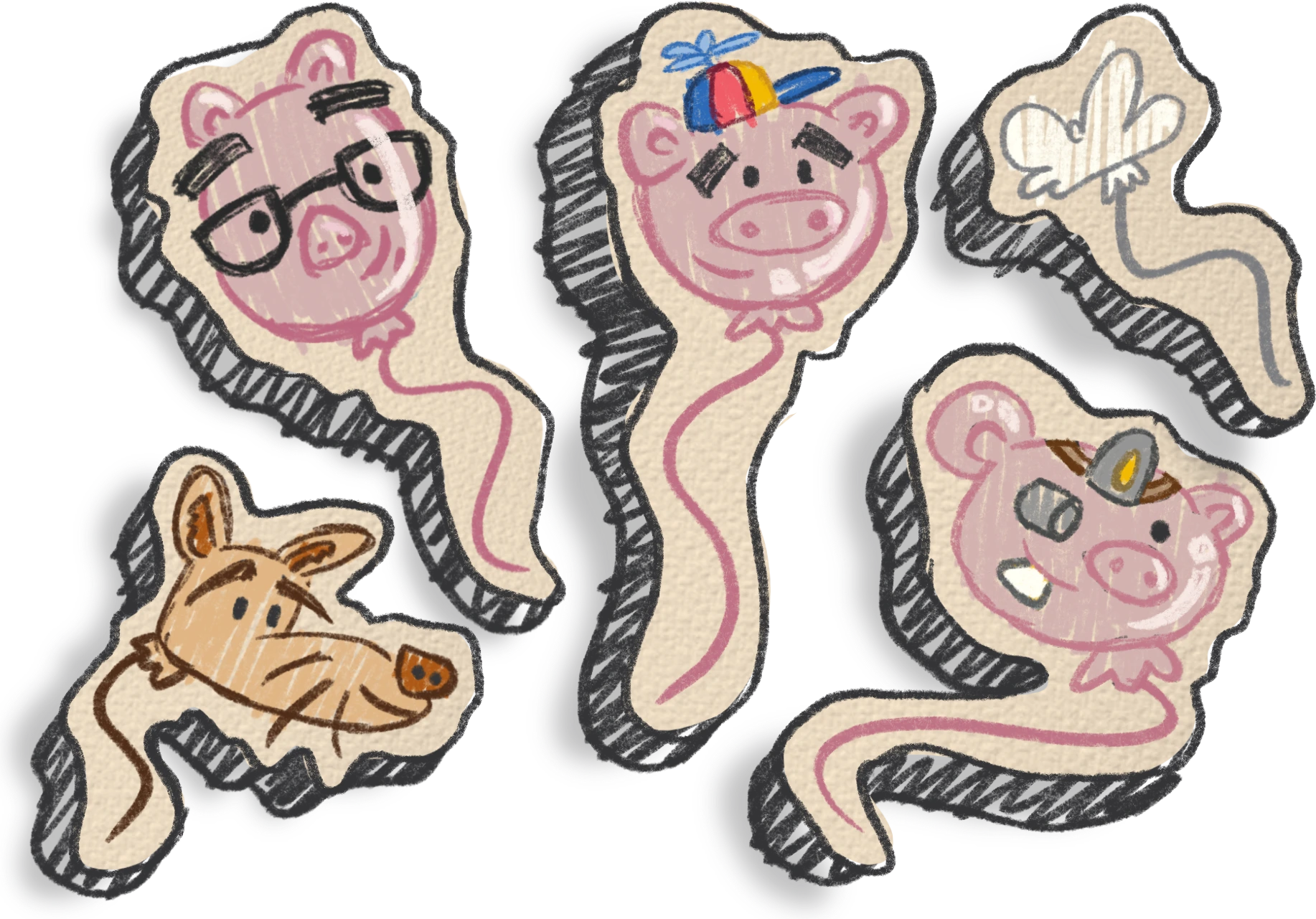
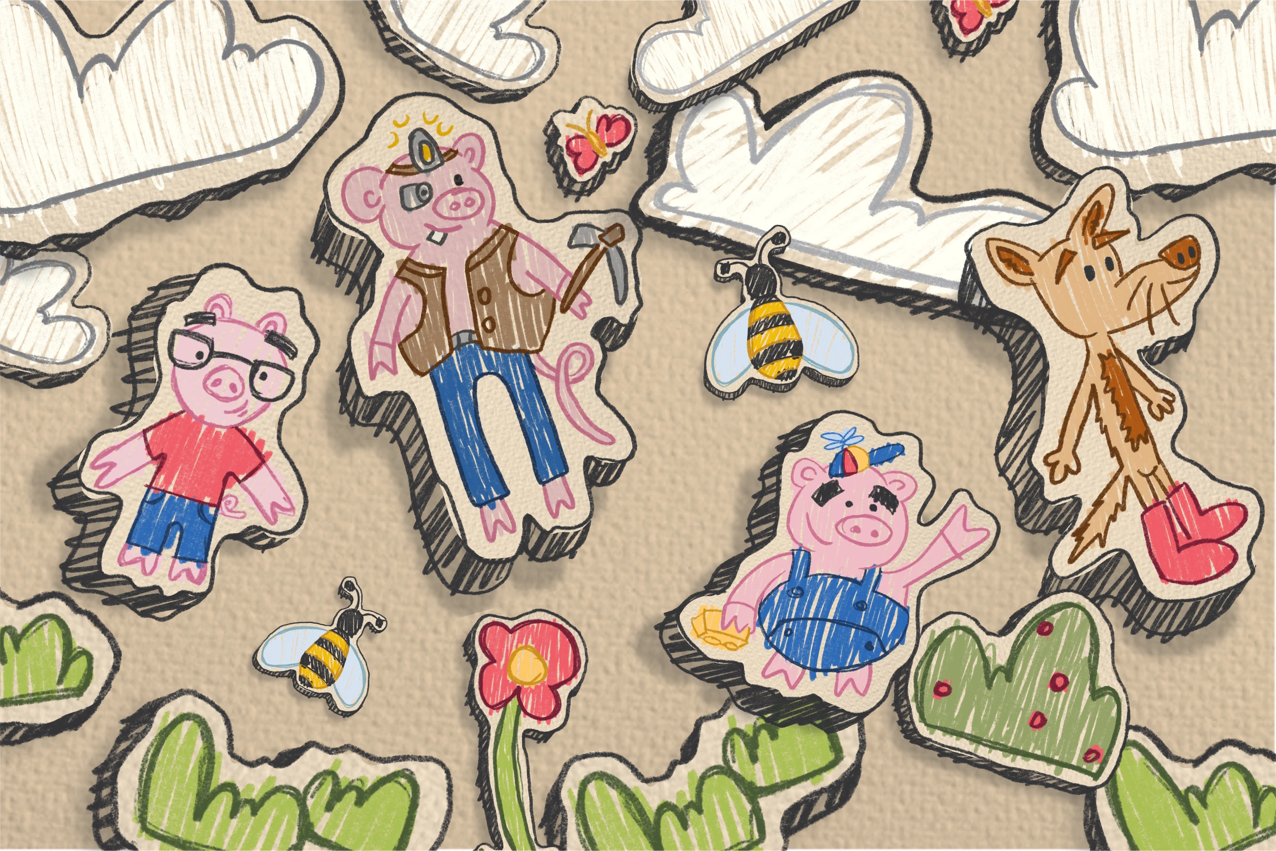
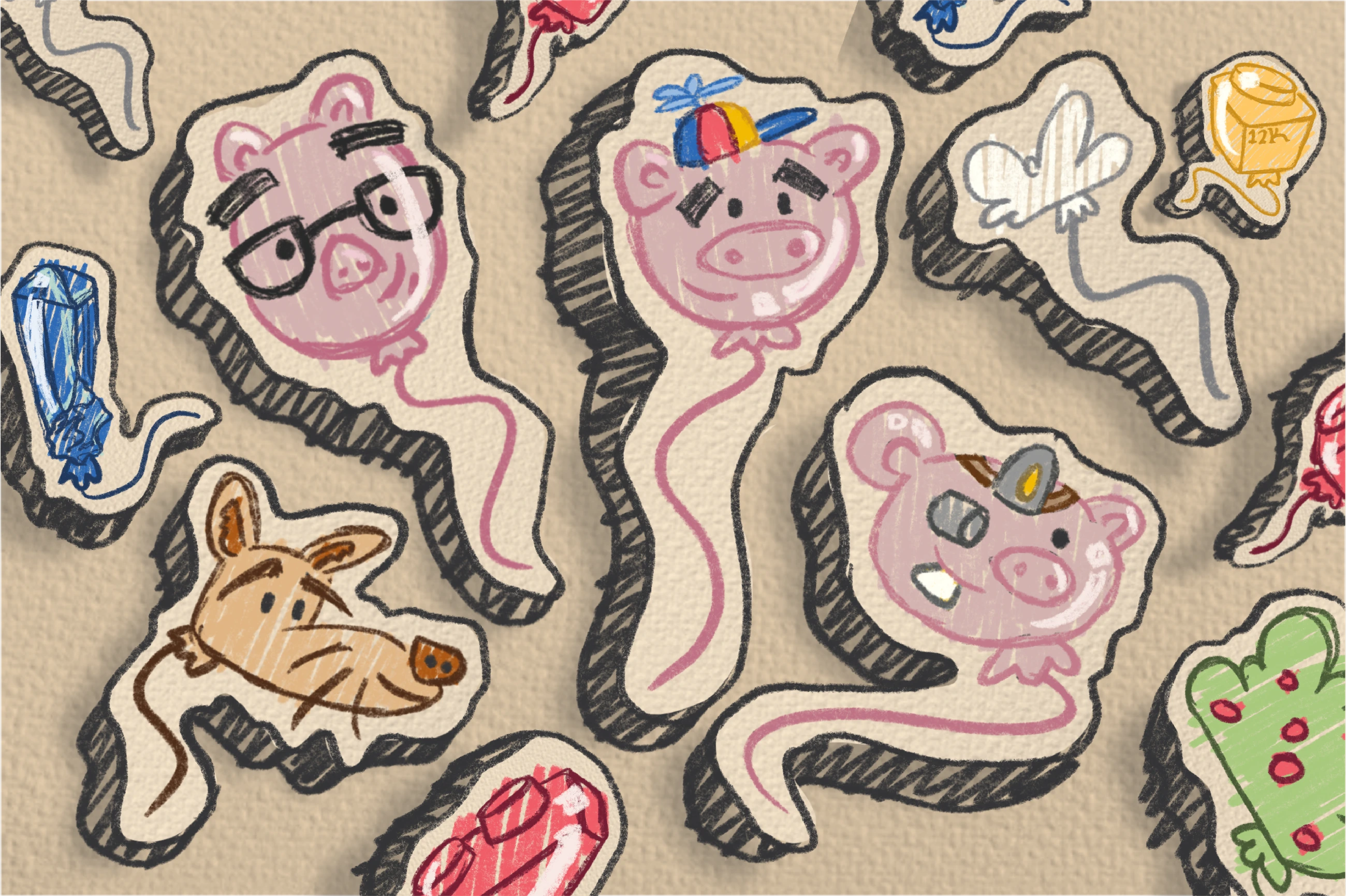
This endpaper design basically grew out of the main idea of balloons, to which —after feedback from the professor in charge— I added the characters’ faces to make it more dynamic and keep it consistent, referencing the story more directly.
The illustration finishes also follow the reference moodboard, something completely new for me, both in the finishes and in the style of illustration, so endpaper one features only the regular characters and the second one shows them as balloons.
Typography
abcdefghijklmnñopqrstuvwxyz
0123456789 ¿?¡!
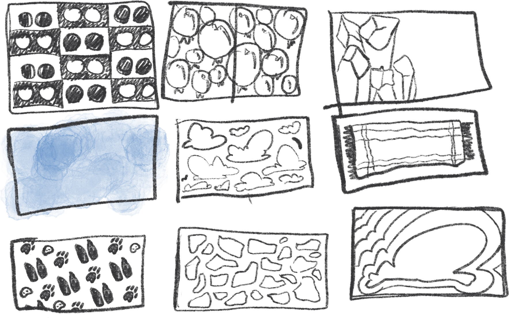
Texture sketches and endpaper design
Scene 1
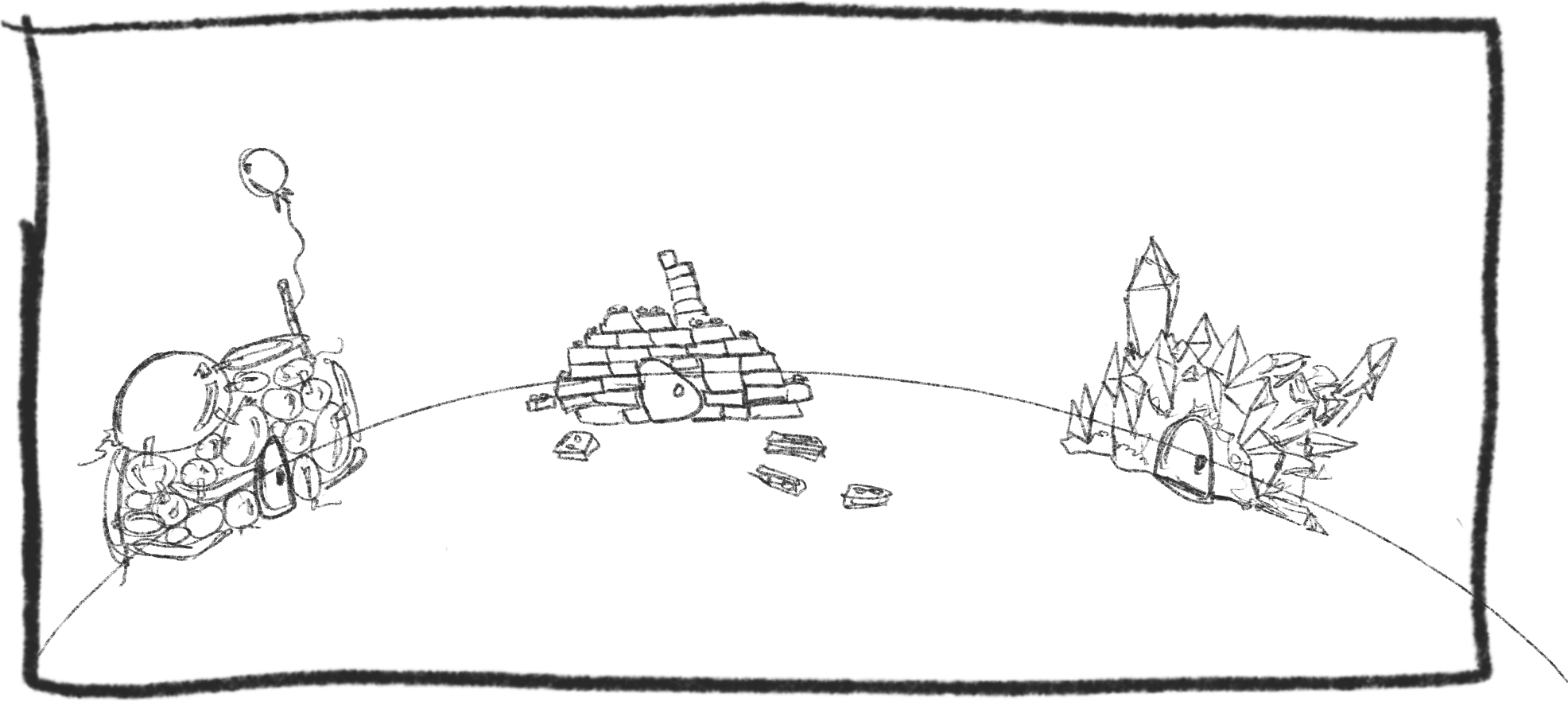
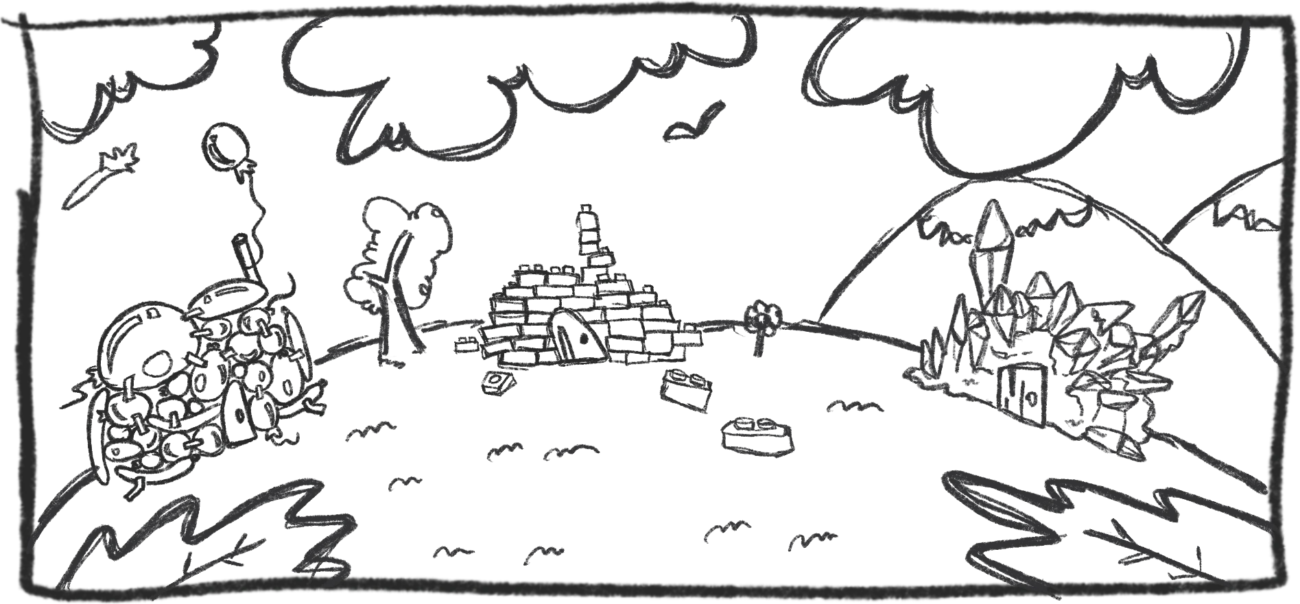
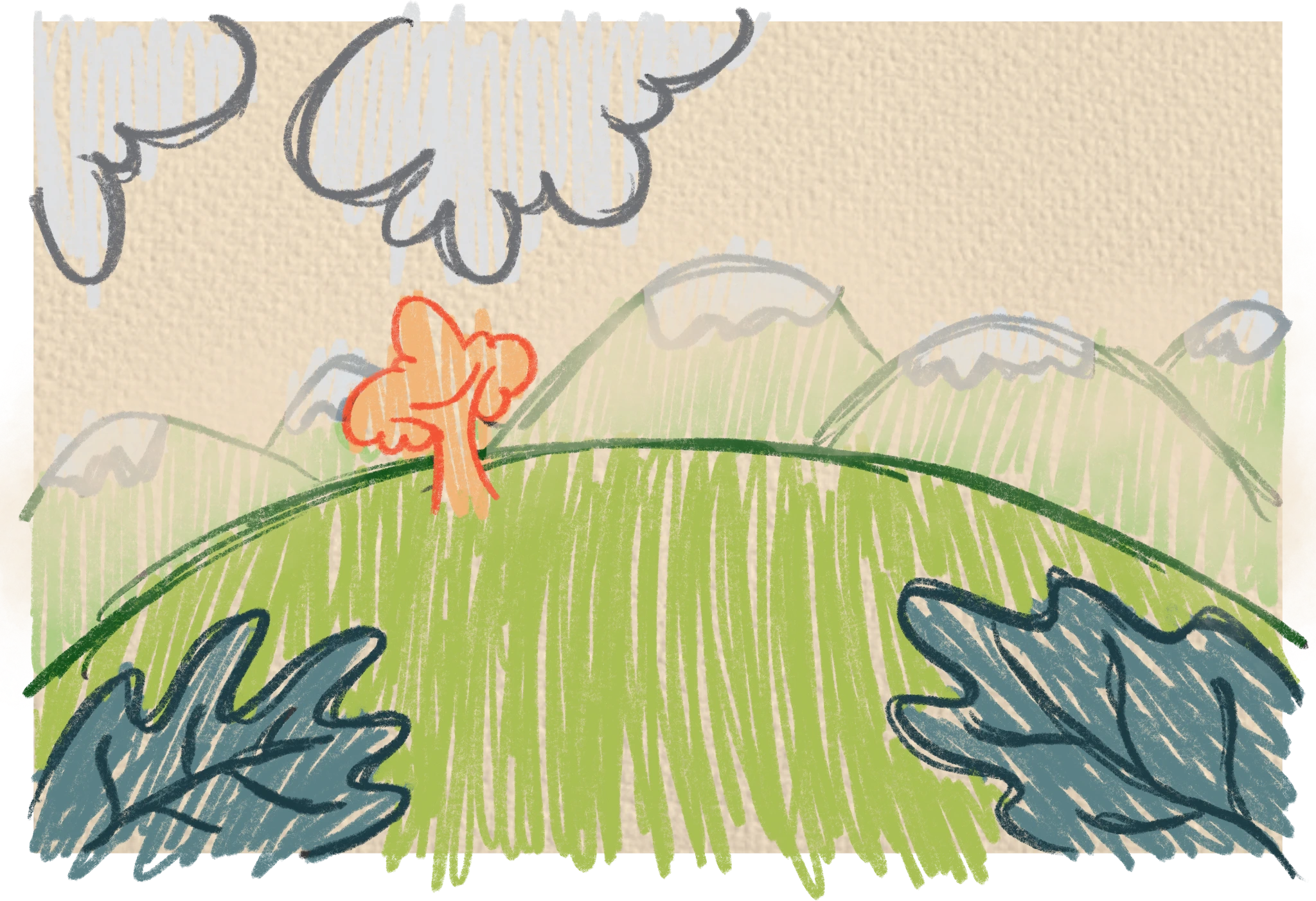
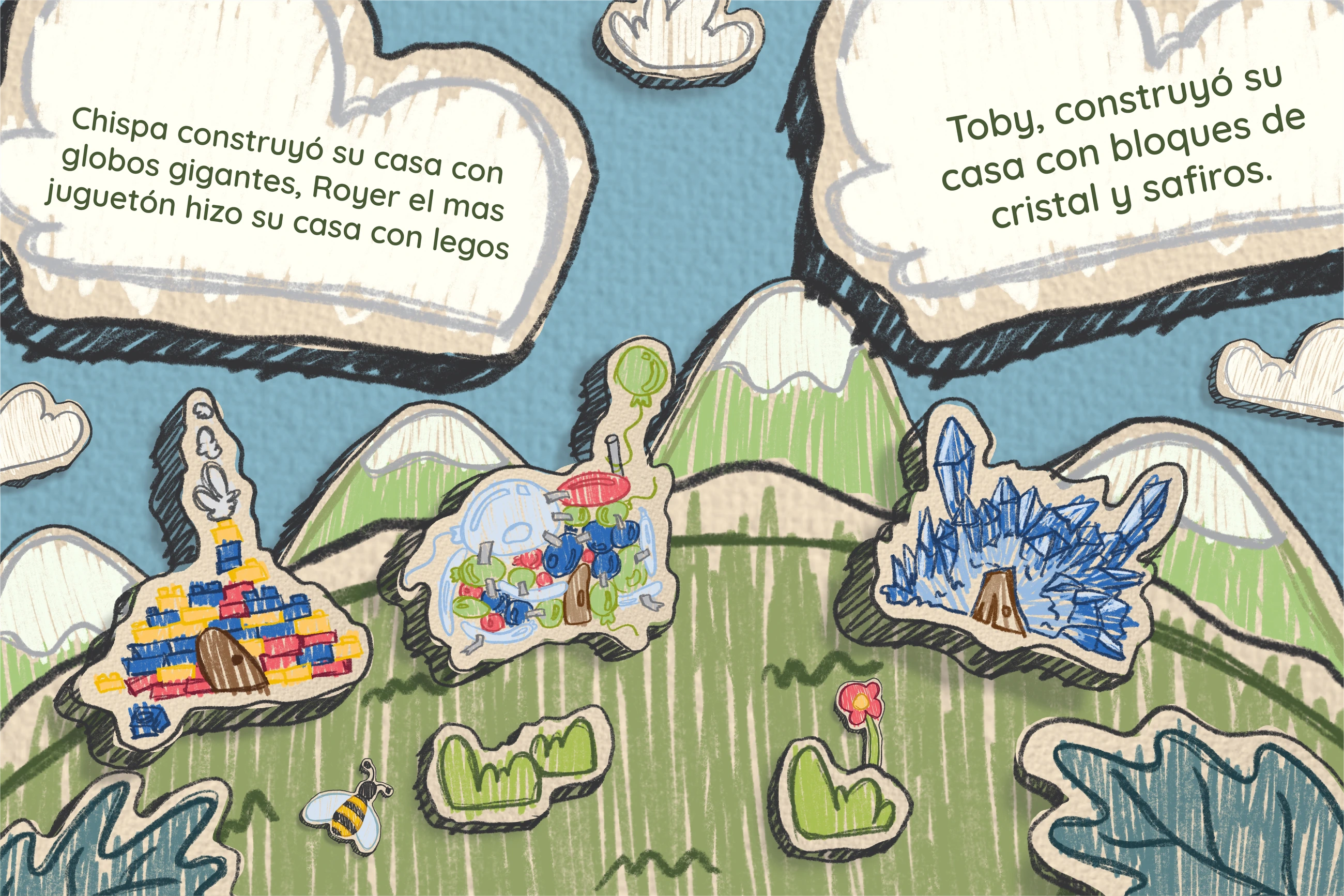
The first scene shows how the idea is already clear from the sketch. The idea is to show the pigs’ houses, with the difference that they’re made of other materials, to change the story a little so it doesn’t feel so repetitive.
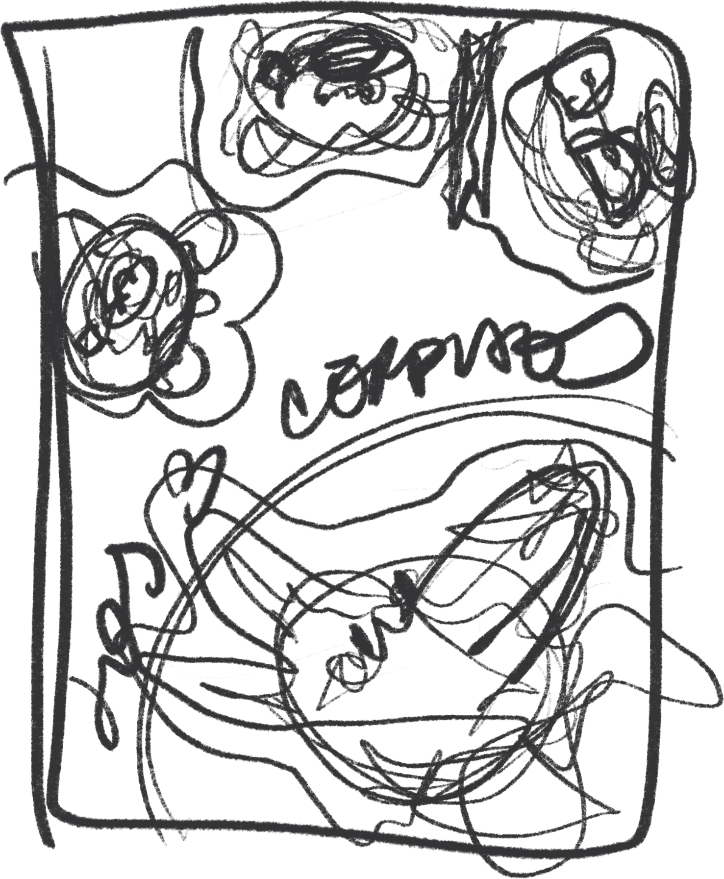
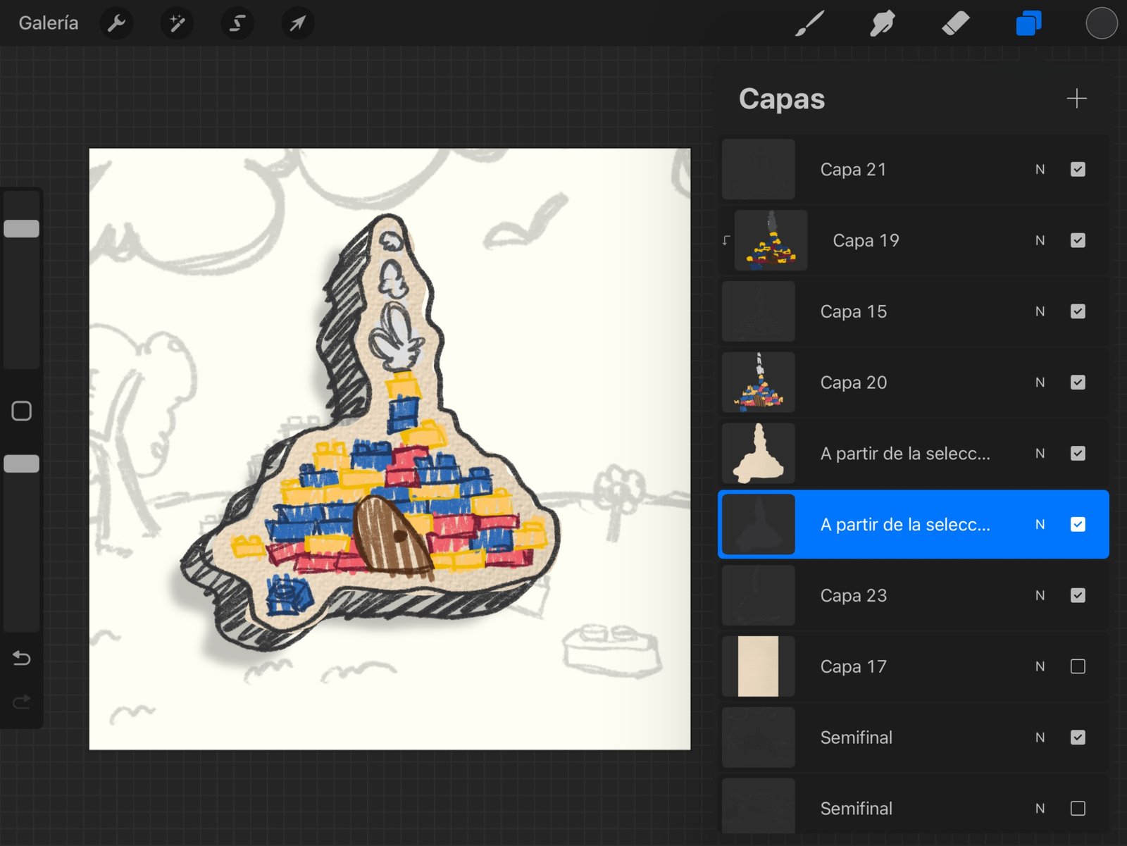
From this paragraph down you can see how it all began, first in a more basic form and then more developed. Part of the process is also shown in the program I used, which in this case is Procreate. On the right is a first pass at the scene and, finally, the finished scene with all the corrections made.
The result is very eye-catching and direct in terms of the message or text it includes.
Scene 2
Moving on to the second scene, I wanted to somehow keep following the original story of The Three Little Pigs, but as you read at the beginning of the story, you already know Bruno is up to some mischief.
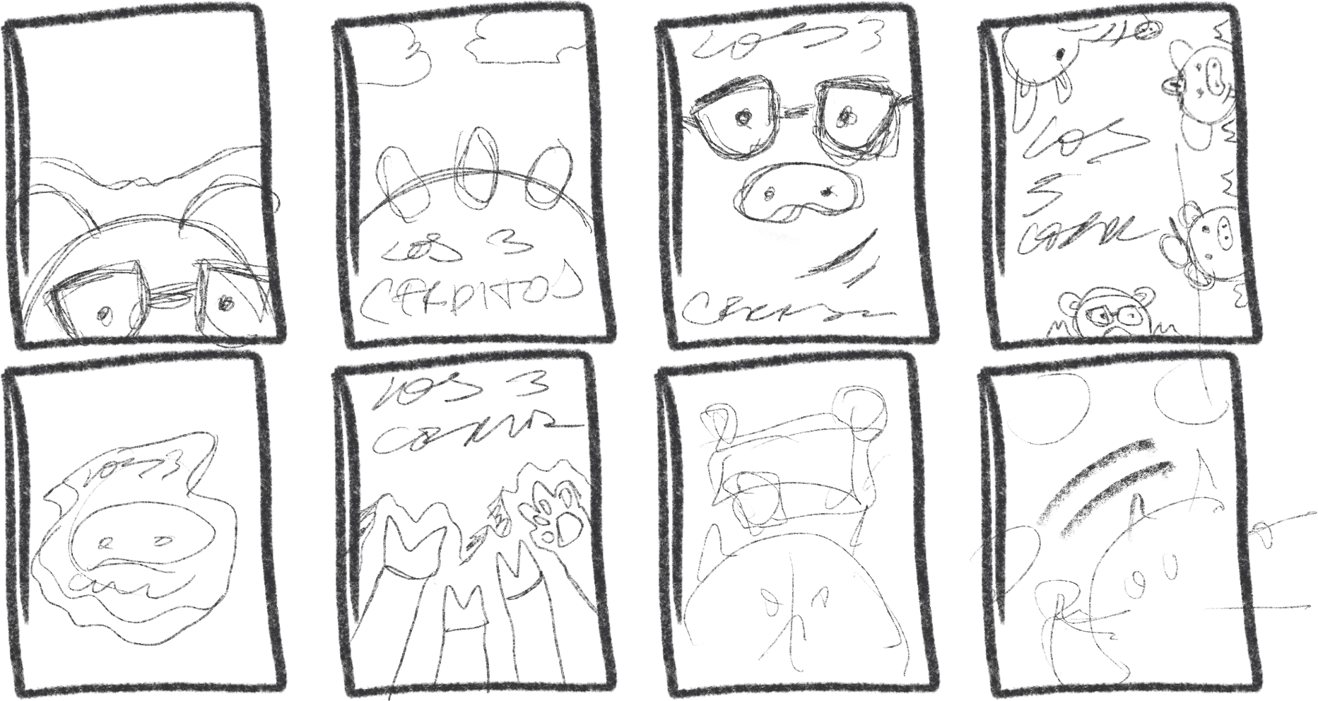
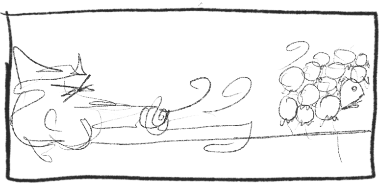
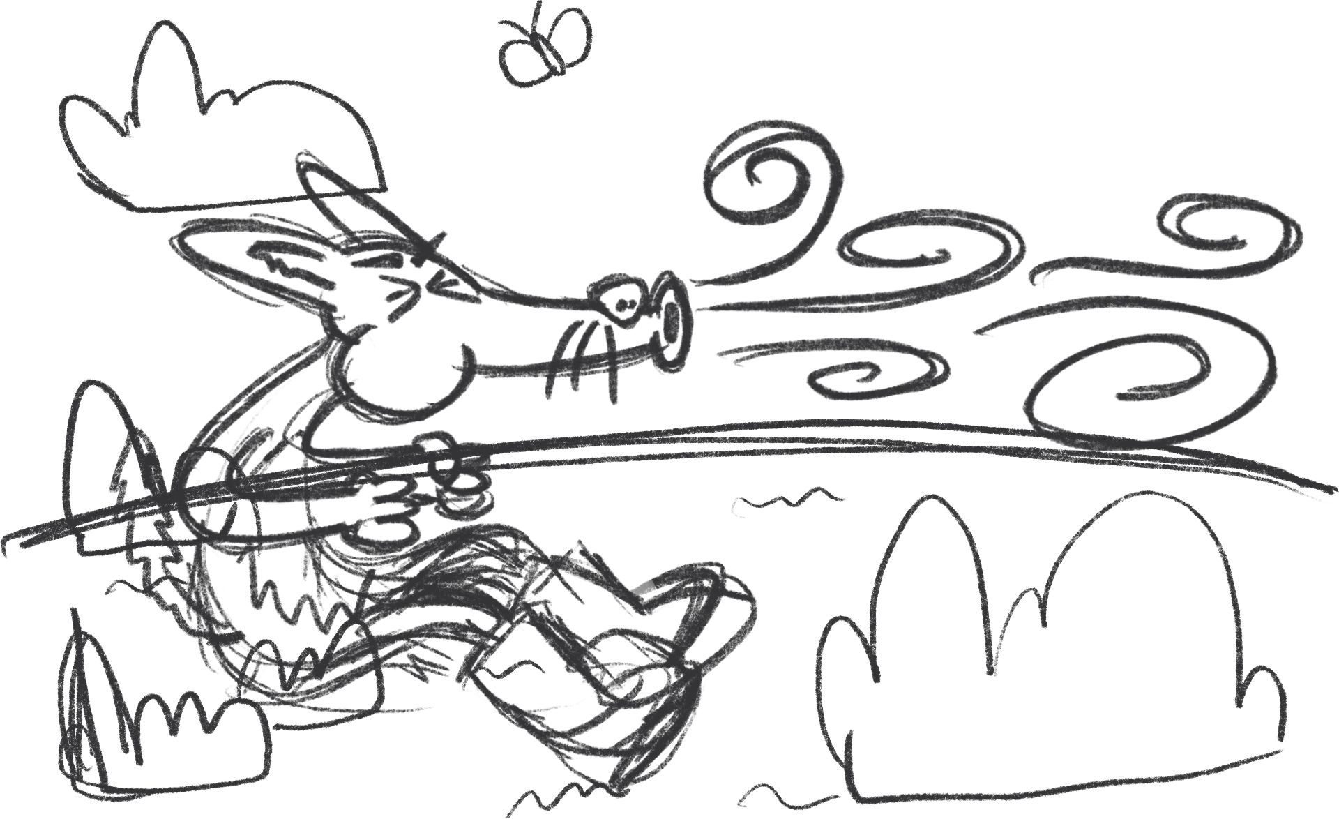
The initial sketch helped keep the main idea, but as I developed the illustration I saw it needed more detail and more elements to add storytelling, which is why we have a second, more refined sketch.
And here we’re getting to a better result, with more elements and, above all, more movement in the character, in this case “Bruno,” whose expression shows he’s blowing hard.
Now it has to be taken to color and given more definition so we can still make corrections and improvements, because they always come up, and that’s the interesting part of this kind of exercise: as you move forward and take a breather, you start to see opportunities for improvement.
Scene 3
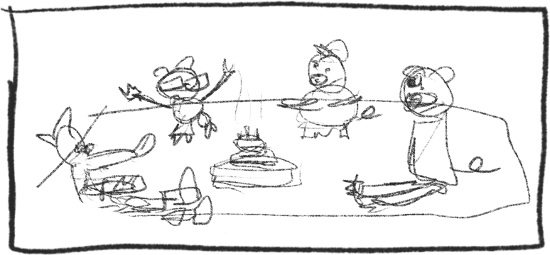
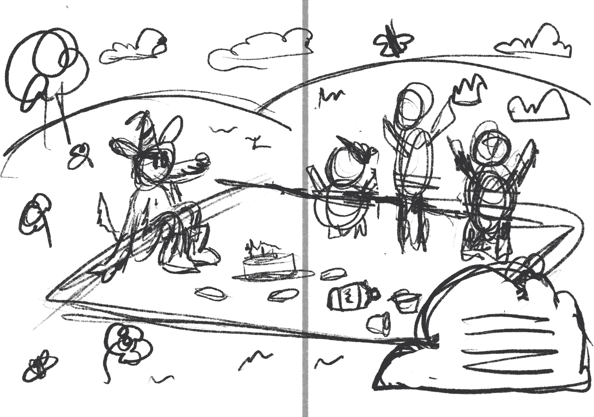
And finally, the last scene of the exercise doesn’t mean it stops here; it’s just a selection of the many scenes that could come out of the full story. So I tried to capture the opening scene of the tale, the middle scene and, lastly, the ending. As you can see in this initial sketch, the idea is that they all end up sharing together, marking a clear difference from the original tale.
And, as always, the core idea changes and improves; that’s why it’s important to keep exploring to achieve a more balanced composition and, above all, a more detailed one.
Cover design
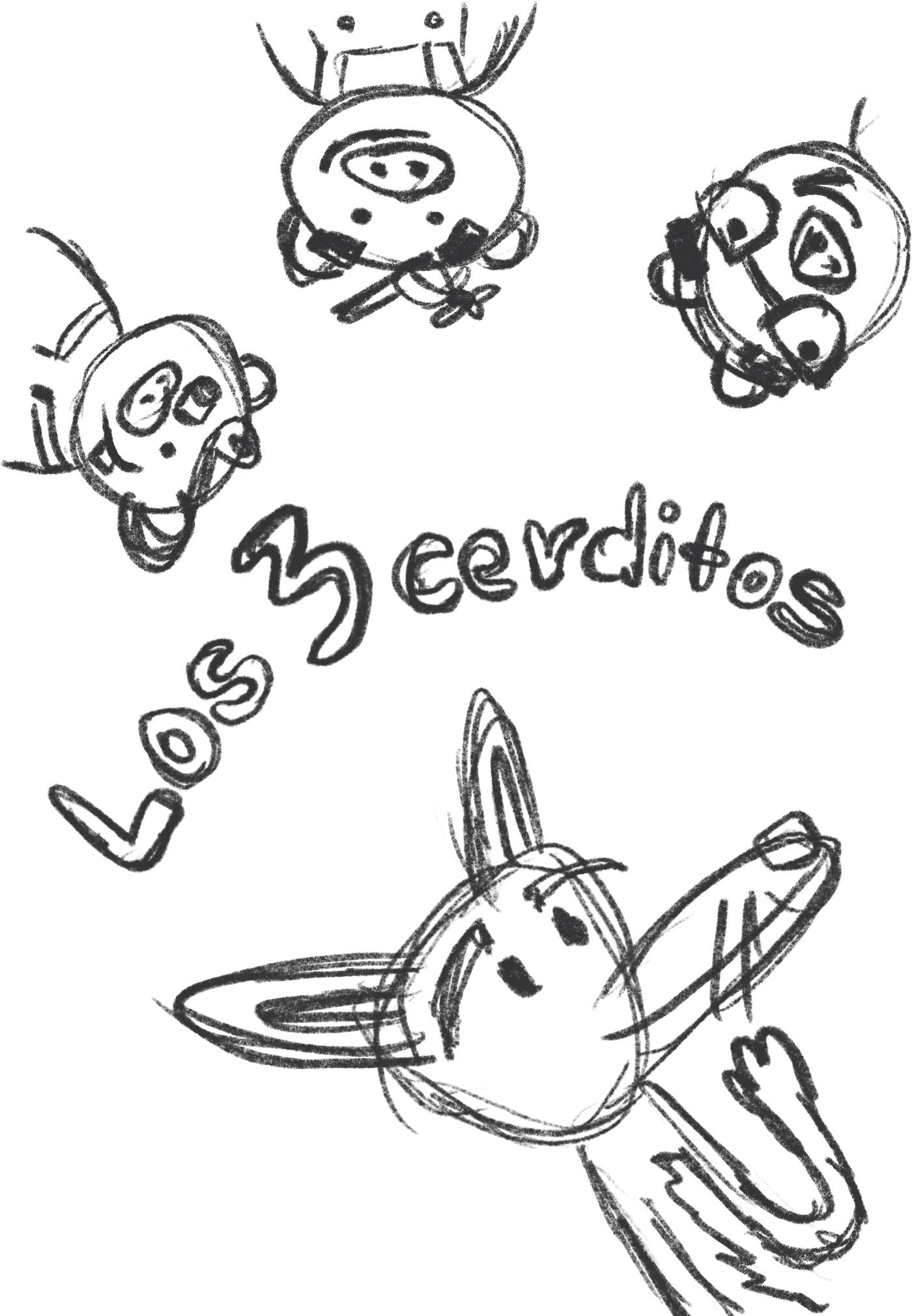
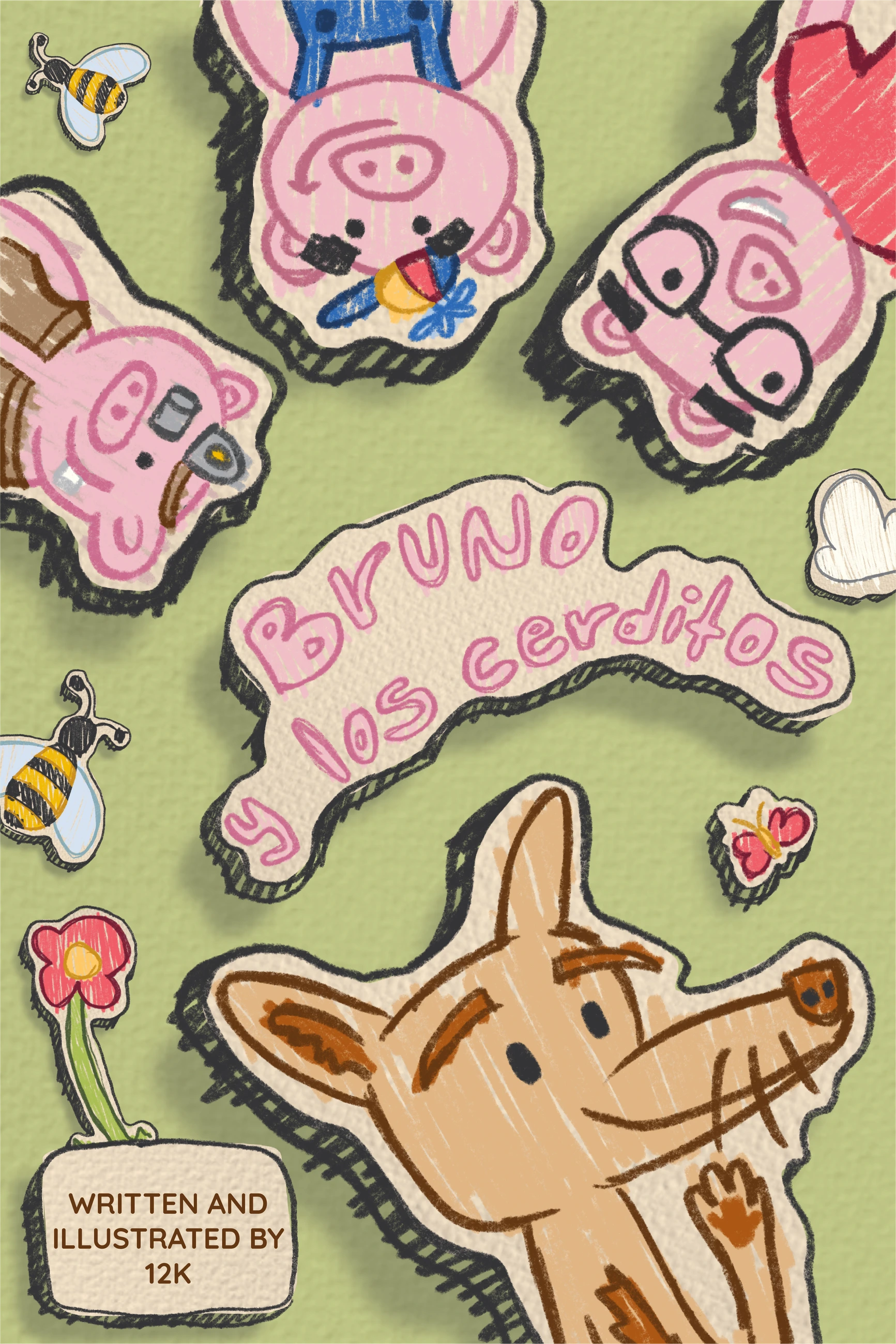
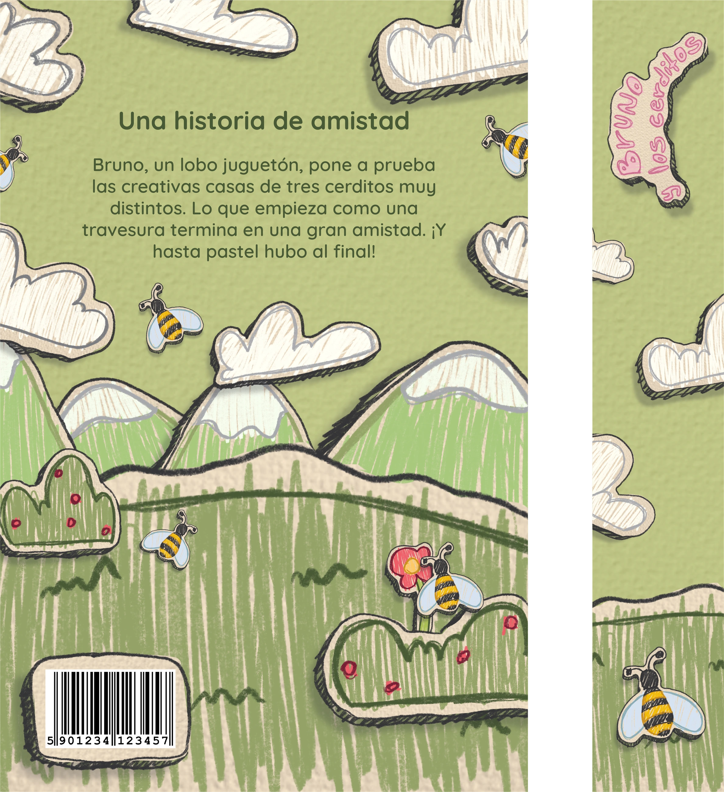
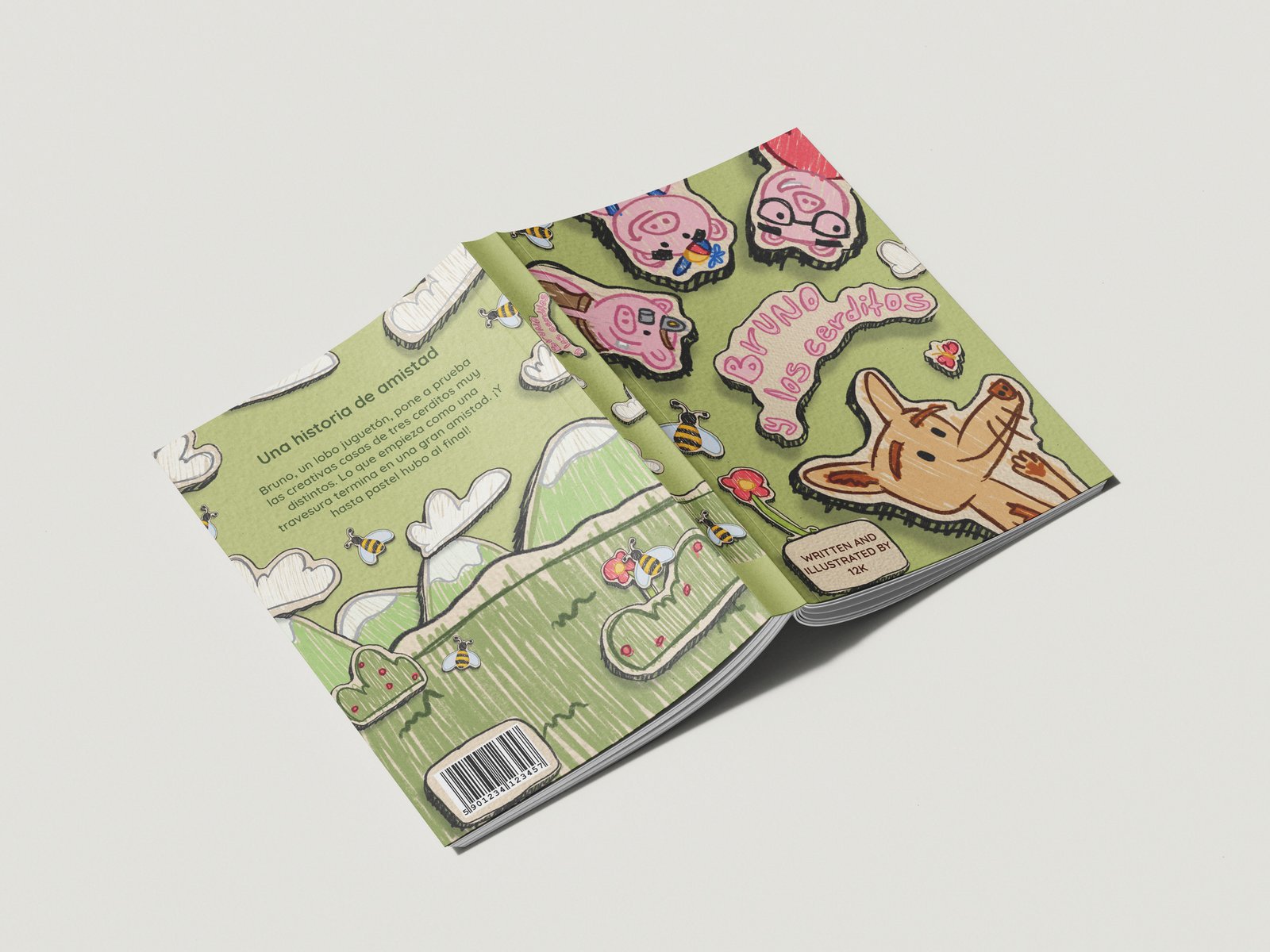
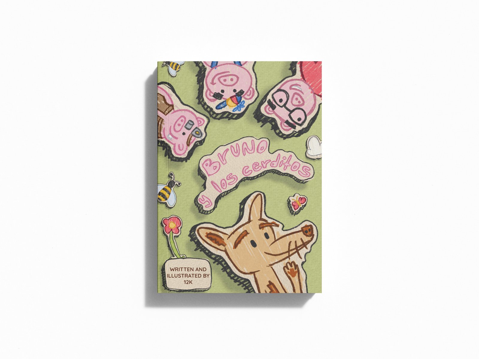
I also designed the front cover, back cover and spine of the children’s book. Below I show part of the creative process, from how the project began to its final result, along with some mockups that give a preview closer to the real thing.