Graphic design
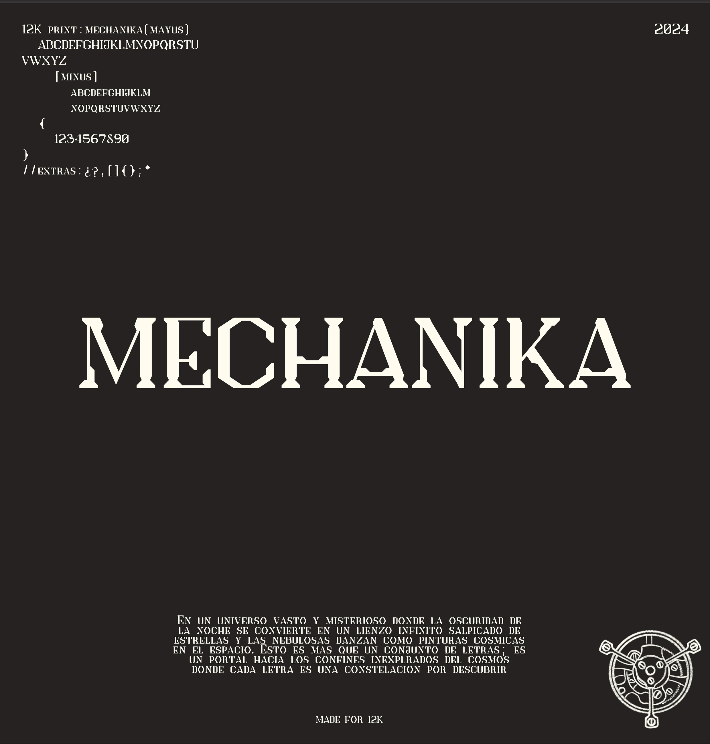
Mechanika, Typeface
A display typeface inspired by the engineering of a high-end watch, built in Glyphs with small caps.
Concept
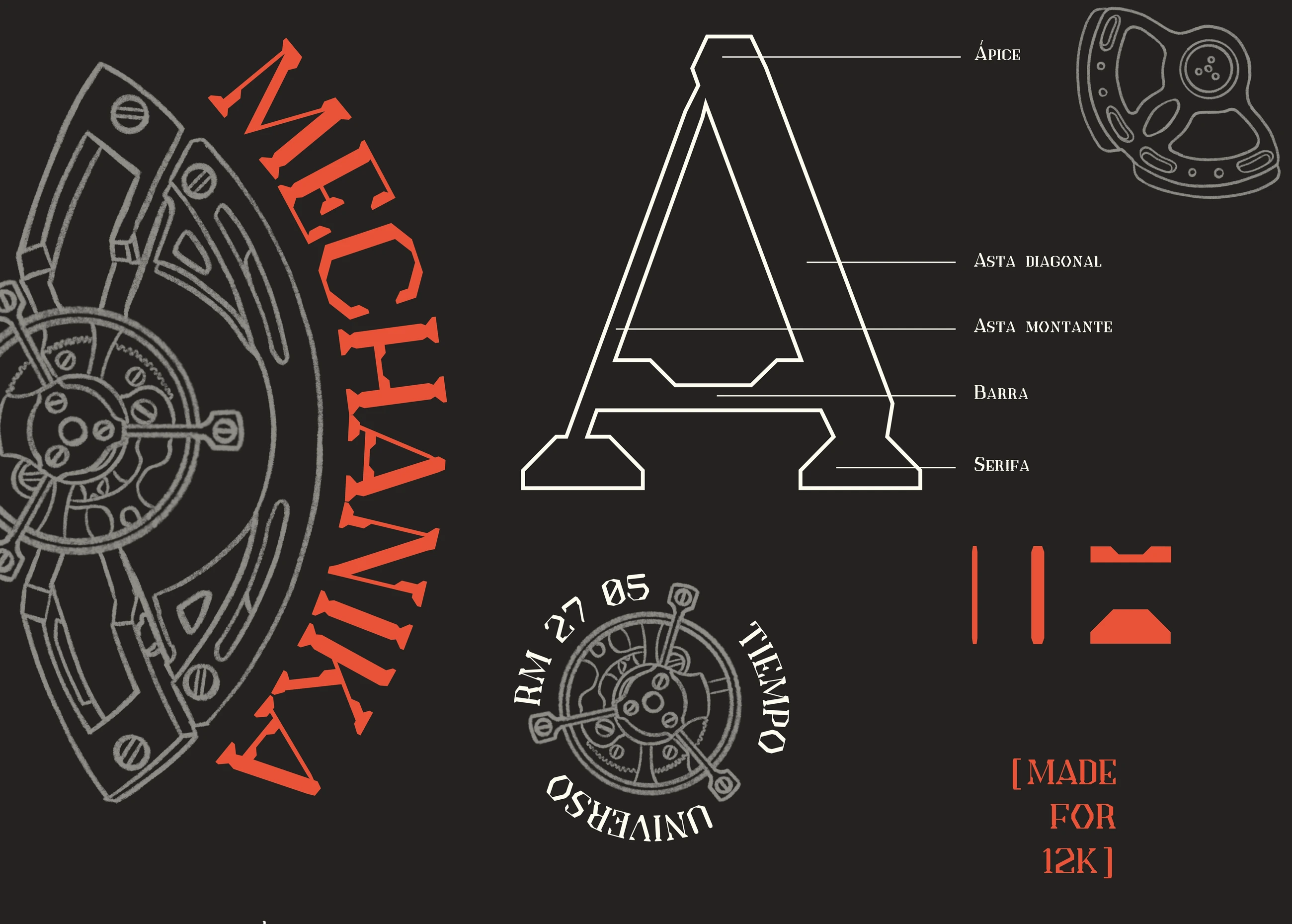
Fusing the precision of a luxury watch with the majesty of the cosmos. Each letter, designed with intricate details that evoke the gears and components of a watch, seems to be in motion, like a constellation in the vast universe. Inspired by mechanical complexity and the eternity of time.
Inspiration
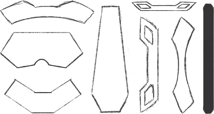
The main reason and inspiration behind this typeface were the mechanisms of this kind of watch. In this case, I used a Richard Mille as a reference, specifically the RM 27-05, since, personally, it’s one of my favorite high-end watch brands.
The engineering behind this kind of piece is so sophisticated that I thought it would be a great idea to take certain elements and create something new, and I pulled it off. Beyond that, I personally always write in capital letters, so instead of using traditional lowercase letters, the choice was to work with small caps, which are basically capitals with small typographic details and adjustments. For this I used Glyphs, which let me refine the finish of every character.
Richard Mille is a relatively young brand, but with a great story and exceptional work. It specializes in, and stands out for, the design of its pieces, most of them with this kind of shape and built for high-performance sports; they are ultra-limited and reach sky-high prices.
Sketching

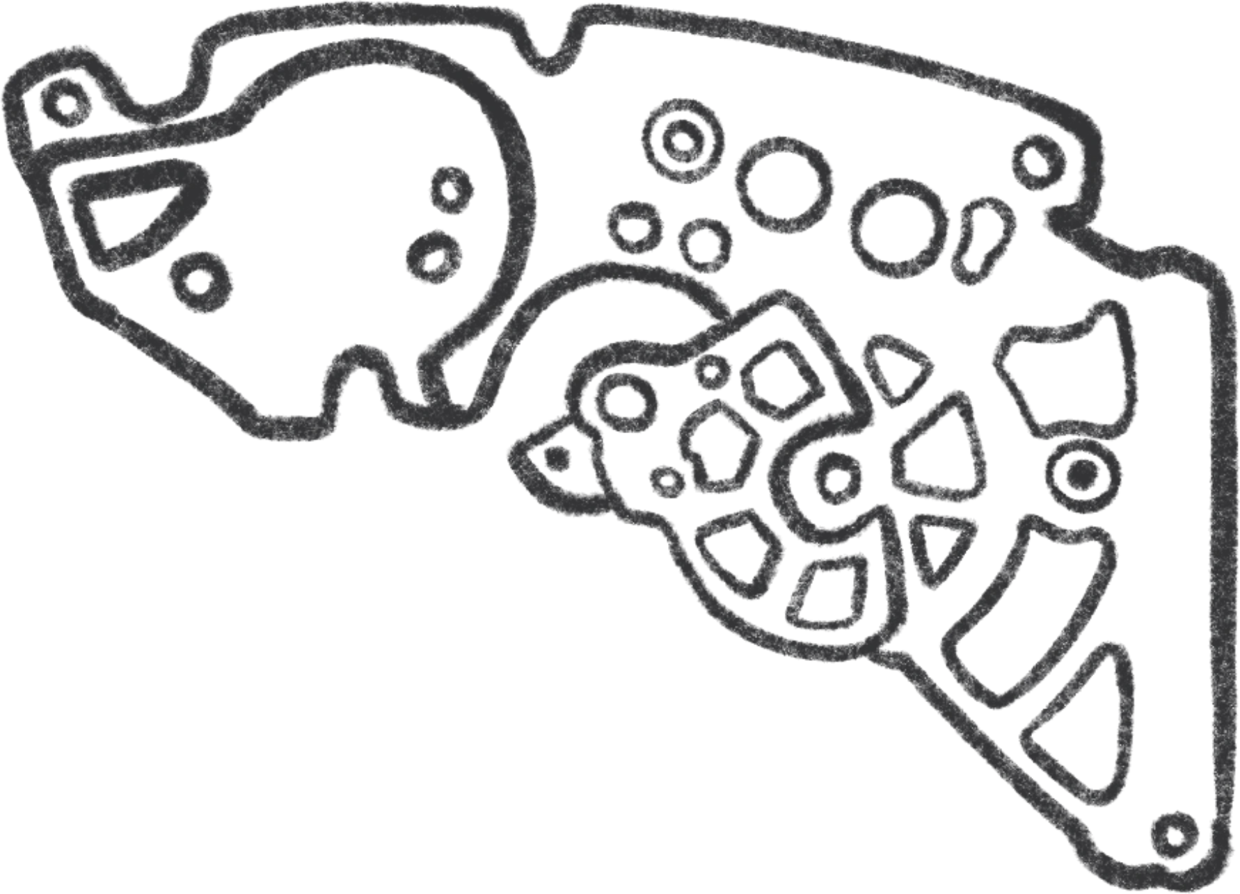
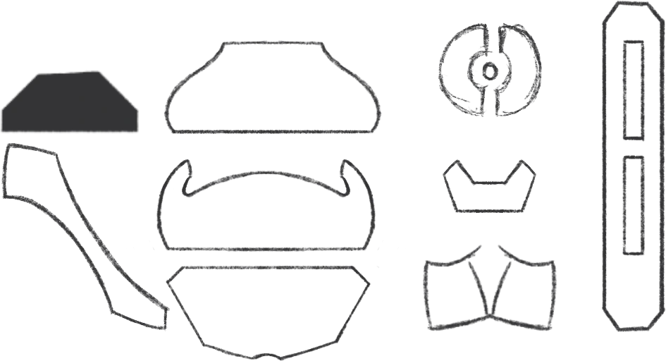
Movement parts



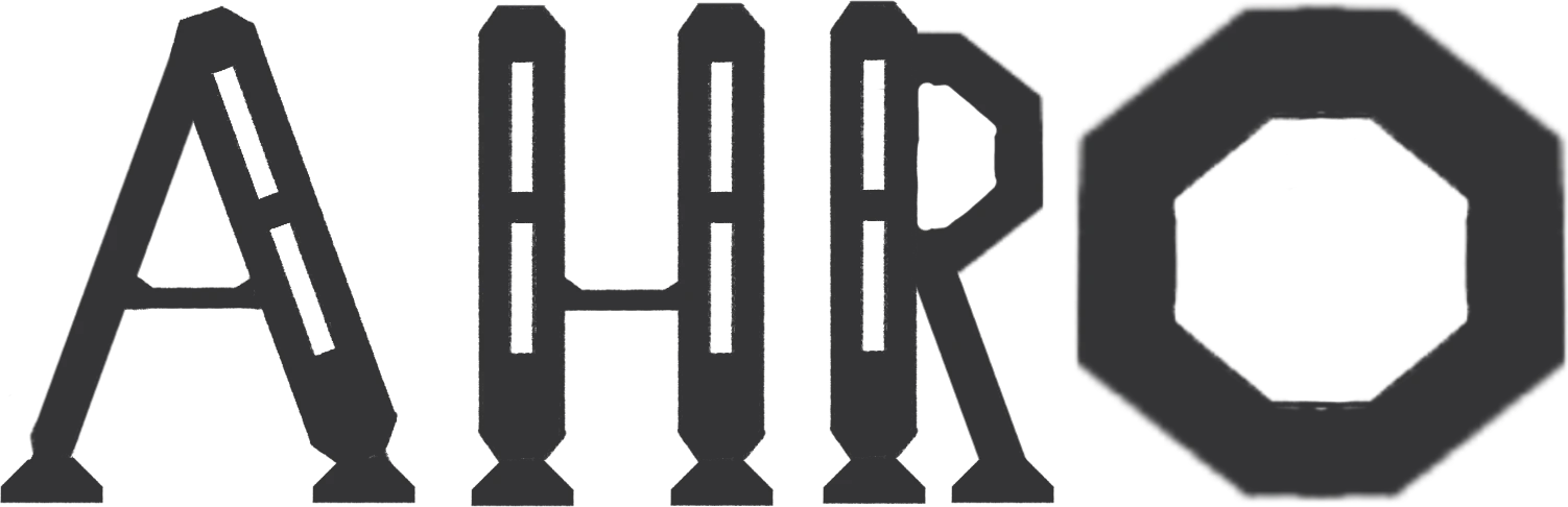
First letters
These four letters are the first ones drawn to preview how words and phrases come together and to decide which adjustments are needed, since basically all the others start from and are built on these four.
Specimen
In a vast and mysterious universe, where the darkness of night becomes an infinite canvas sprinkled with stars and nebulae dance like cosmic paintings in space. This is more than a set of letters; it is a portal to the unexplored reaches of the cosmos, where every letter is a constellation waiting to be discovered.